Top 10 Packaging Trends for 2016

According to a 2013 publication by EY, the global consumer packaging market is valued at approximately $400 billion. That figure balloons to $500 billion when industrial end markets are included. [1]


Packaging is clearly a big business, but it’s not just about the materials that cover a product or protect it prior to purchase. First and foremost packaging must grab the attention of its primary audience, stand out from the competition and create a compelling reason to buy.


Packaging must sell the brand proposition and how it can enhance the purchaser’s life, present the product or contents to best effect, fulfill statutory and mandatory requirements, protect contents, help the purchaser use and store the contents appropriately.[2] People buy with emotion first and justify with rational afterwards, regardless of gender or cultural background, so your packaging must touch the heart if you want to move the mind.


Below, we’ll look at combination of 10 emerging and continuing packaging trends for 2016.


1. Packaging with Hand-Drawn Labels


Last month I wrote about ‘What Customers Want: Top 16 Branding Trends for 2016’ and in that article I touched on key trends in the brand arena for the year ahead; personalized, authentic, humanized, interactive, transparency, engaging, and mobile. Packaging is in effect at the sharp edge of these trends too.


Shoppers are gravitating towards brands that convey authenticity and that’s often very effectively conveyed with ‘hand done’ or ‘hand finished’ details. With that in mind, some companies have redesigned their brand packaging to feature carefully hand-drawn labels. The High Weald Brewery is one example. Made in Sussex, England, these artisan brews feature packaging that commands attention [3] and complements the upscale beverages inside, plus conveys warmth that implies the distinctive labels weren’t just hastily made or mass produced as an afterthought.


   High Weald Brewery 600px

Image via www.highwealdbrewery.co.uk


2. Personalized Packaging


Although this trend emerged in 2014, it shows no signs of slowing down. Coca-Cola led the way with bottles that read, “Share a Coke with…” and featured a person’s name. As the trend gained popularity, the labels became more generic and featured names such as “Mom” and “a Friend”. Now, Coca-Cola has a designated website where people can buy personalized Coke bottles.


Nutella, a brand of popular hazelnut spread, has also followed suit by creating packaging with names.  As of October 2015, customers in the UK can request free personalized labels after purchasing Nutella. 


3. Metal Packaging You Can Microwave


Dutch students helped create premium packaging for Emmi, a Swiss dairy brand. Available as part of a ready-to-use fondue kit, the package consists of a metal bowl that can be microwaved or placed in a traditional oven, thanks to a special food-safe lacquer. [4]


 Emmi Fondu Tulip Karton 400g Usa 600px

Image via www.packworld.com


Emmi wanted to keep its brand strong with packaging that encouraged differentiation, and has received critical acclaim for this innovation. It may encourage other companies to develop similarly forward-thinking packages in 2016.


4. Packaging Gets Increasingly Convenient for Customers and Consuming Food


Since consumers increasingly lack free time, many large companies have endeavoured to help them cook dinner as easily as possible. Some smaller establishments are also meeting that growing need.  One such venture is The Black Farmer, also based in the UK.


Case Study: The Black Farmer


Run by Wilfred Emmanuel-Jones, The Black Farmer offers premium meats, including gluten-free options — another growing food trend. It recently announced a pork loin roast that cooks in the package and includes a special blend of spices. [5]


 The Black Farmer Pork Loin Roast In The Bag 600px

Image via www.theblackfarmer.com


Jones says research has shown consumers are not confident enough cooking pork at home because they’re not sure how to do it well. The roast-in-the-bag design cooks the pork in less than an hour, and most importantly does not require preparation.


This convenience is commonly offered for chicken, but The Black Farmer is the first brand to enter the pork market with such packaging. Translucent material makes it easy to see the contents, while this concept appeals to people who want quick dinners but won’t sacrifice high quality for convenience.


5. Materials and Structure Are More Than What They Seem


Global Closure Systems has engineered a new type of plastic material that mimics the look and feel of glass. These shatterproof containers have two layers and are more efficient to produce than previous kinds of containers made by GCS.[6] Not only is the packaging more pleasing to the eye compared to plastic, but it’s also safer for consumers since it’s less vulnerable to breakage.


 Global Closure Systems1112

Image via www.packagingeurope.com


Additionally, Sonoco has developed a package with a metal top and an easy-to-open pull tab, plus clear plastic sides so consumers can see inside.  Called the TrueVue Can, the BPA-free product has a customizable height and wall thickness, so manufacturers can request packaging that shows off their products effectively.


Tru Vue Plastic Can 600px 

Image via www.sonoco.com


6. Snack Packaging On-The-Go Becomes Handier


Last summer, the Hormel Foods Corporation expanded its brand of Skippy peanut butter by offering peanut butter-inspired snacks featuring a crunchy center with a soft peanut butter coating. They’re sold in clear plastic containers that not only make the snacks easy to consumer on the go, but enable customers to view them before purchasing.  However, it’s not the only product appealing to snack lovers who crave convenience.


Case Study: Walgreens


Walgreens followed Hormel Food Corporation’s lead by upgrading its private-label packages of premium nuts. Specifically, a section of the container is removable to allow consumers to use it as a single-serving bowl. The portability and versatility of the new packaging saw sales grow by 23 percent, and helped it earn a gold medal at the National Association of Container Distributors (NACD) Packaging Awards last year. [7]


 Walgreensnuts 500px

Image via www.chiefpackagingofficer.com


7. Increasing Prevalence of Recyclable – Coffee Pods


Last spring, Keurig began making recyclable coffee pods, much to the delight of eco-friendly consumers. [8]  In November, news broke that Wolfgang Puck would do the same. [9]  


These more sustainable forms of packaging follow a growing trend, not only amongst consumer preferences but are also at a statutory and industry level in response to the even more pressing environmental issues associated with excessive packaging, pollution and landfill. By introducing this Earth-conscious functionality, brands are signaling consumers can still enjoy preferred products without being wasteful.


 Wolfgang Puck 500px

Image via www.packagingdigest.com


It also potentially becomes a more transparent and honest part of their CSR brand strategy, a factor which has a huge impact on Millennials’ decisions to purchase a brand. In fact it’s worth noting that six out of ten Millennials feel personally responsible for making a difference — all of which impacts their brand choices. 90 percent of Millennials actively purchase brands associated with a cause and half of Millennial consumers will abandon a brand if they disagree with the company’s ethics.


8. Packaging That Makes It Clear How Consumers Can Give Back – CSR


Expect to see a larger amount of packaging that spells out how consumers can make a difference by buying a particular product. Piggy Bank Wines, for example, gives 25 cents from every bottle sold to one of three charities.


   Piggy Bank Wines Home Pg 600px

Image via www.piggybankwine.com


The packaging features a QR code consumers can scan so they can vote for their favorite of the three organizations. Once the charitable fund reaches $5,000, voting ceases and the money is distributed accordingly.


Case Study: SoapBox


In a similar CSR-related vein, the SoapBox company features a “Hope Code” on its packaging that users can use to find out where the profits from that product are going. [10] Every code is unique, meaning people can theoretically support a different charitable cause with each purchase.


   Soap Box Soaps 600px

Image via www.soapboxsoaps.com


Fittingly, all the company’s charitable efforts focus on sanitation needs and clean water. This outreach matches the brand’s focus and is an inherent part of it’s brand values, all of which helps encourage its primary customers to embrace the cause and the brand.


9. Packaging That Makes Product Dispensing Simpler


The makers of Daisy Sour Cream have released a new package for its product that allows consumers to dispense the ingredient without a spoon. Fitted with a flexible valve, the package makes it easy to dispense the right portion size. Also, the foil package fits in a refrigerator door, ensuring it maintains front of sight visibility for consumer and encouraging consumption before the expiration date.  [11]


 Daisy Sour Cream

Image via www.daisybrand.com


In 2016, it’s more likely brand owners will increasingly use packaging more imaginatively and in new ways to give them a more competitive edge to ultimately increase profitability.


10. More Beer Packaging May Include Nutrition Facts


In the United States, it’s voluntary for beer manufacturers to include nutrition facts on packaging. As you may expect, nutritional content is most often highlighted on brews touted as low calorie.


The concern with calories has also attracted attention in the United Kingdom. [12] The Local Government Association (LGA) is a lobbying group representing more than 350 councils. It argues alcohol is contributing to the obesity crisis, and consumers generally don’t realize how many calories alcohol contains. It remains to be seen what’ll happen with alcohol packaging in the UK.


It’s clear from the trends above that packaging does much more than just protect merchandise before it’s sold, or inform people about the products inside. It assists customers in making the right choice, it makes it easier for consumers to use the product, which may inspire greater loyalty, helps buyers do good by giving back and even make us admire how far science has come through new, high-tech packaging solutions.


Key Takeaways


  • Ideally, successful packaging must be visually pleasing, communicate the brand’s key message effectively and be user friendly — done well, it’s multi-purpose in its design both functionally and aesthetically


  • Appealing to consumers’ desire for convenience is a worthwhile strategy, if that packaging intent doesn’t undermine the perceived value of the brand


  • Societal trends, such as increased giving with active CSR brand strategies or recycling, will increasingly influence packaging trends


  • Simplicity, both in the way a package looks and functions in terms of ease of use, is a growing trend with consumers looking for brands with a sense of the more authentic, transparent and ‘responsible’ commitments to society


Questions to Consider


  • What are the technical and operational needs required for your brand’s future packaging? Have you adequately invested in those areas or conducted a brand audit to evaluate your changing market requirements?


  • Have you sought feedback from your primary customer to find out about the kind of improvements they’d like to see in your brand and its packaging, and how they feel about those planned changes if your considering rebranding?


  • Recyclable coffee pods are examples of how well-known brands adapted to societal trends. Have you considered how your brand could do the same?


  • SoapBox judiciously combines its CSR strategy with innovative packaging design. How might your brand follow suit?


  • Personalization is an increasingly important brand trend but for packaging it can be prohibitively expensive. Are there ways you could tap into this growing trend and leverage it in a way that’s more cost effective?


You may also like:


• What Customers Want: Top 16 Branding Trends in 2016


• Packaging Design: Top 16 Tips for Great Eye-Catching Packaging Design


• Packaging Design: How to Make it into an Irresistible Customer Brand Magnet


• Rebranding Strategy: Why Your Rebrand Must Embrace Storytelling


• Limited Edition Packaging: How to Use it as Part of Your Brand Strategy


• Brand Profiling: Top 6 Components to Creating a Strong Brand Personality


• Packaging Design: How It Can Make or Break Your Brand


• Creating New Brands: Top 10 Tips for Brand Success  


• Colour Psychology: Cracking the Colour Code for Profitable Branding


• Brand Personality: Is Your Brand’s Character Big Enough to Compete?


[1] http://www.ey.com, “Unwrapping the Packing Industry: Seven Factors for Success”, 2013.

[2] Simon Preece, http://www.forbes.com, “The Five Things Product Packaging Must Do”, July 2014.

[3] http://www.thedieline.com, “High Weald Brewery”, November 2015.

[4] Anne Marie Mohan, http://www.packworld.com, “Microwavable Metal Bowl Developed for Ready to (H)eat Fondue”, December 2015.

[5]  http://www.foodbev.com, “The Black Farmer Launches Roast-in-the-Bag Pork Loin Joints”, December 2015.

[6] http://www.packagingeurope.com, “Global Closure Systems Provides ‘Glass-Like’ Plastic Jar,” November 2015.

[7] http://www.chiefpackagingofficer.com, “New Nut Container Upgrades Walgreens Private Label Snack Packaging,” December 2015.

[8]  http://www.businesswire.com, Keurig Makes Coffee-To-Go Easier with Launch of K-Mug Pods,” March 2015.

[9] Kate Bertrand Connolly, http://www.packagingdigest.com, Wolfgang Puck Switches to Recyclable Pods,” November 2015.

[10] Kate Bertrand Connolly, http://www.packagingdigest.com “SoapBox’s HopeCode Shows Consumers How Their Purchases Are Helping,” June 2015.

[11] Dave Johnson, http://www.packagingstrategies.com, “Daisy Turns Sour Cream Upside Down with New Flexible Package,” December 2015.

[12] Seb Joseph, http://www.thedrum.com, “Alcohol Packaging Should Sport Calorie Labels, Warn LGA”, January 2016.


Rebranding Strategy: Gems of Wisdom from 5 Successful Brand Revitalizations

Rebranding is a relatively broad term, as it encompasses both large and small-scale changes to an existing brand, which aim to resurrect a failing brand, reposition the brand and allow the company to reach out to a new target market, or simply help the brand keep up with the times.


While some brands adopt a “back to the drawing board” strategy and change everything from their logo and name to their brand values and product packaging design, a good brand revitalization strategy can sometimes be limited to a few low-key changes that enable the brand to stay relevant or differentiate itself from the competition.   


When Should a Company Invest in a Rebrand?

An impressive 61% of consumers stated that an exceptional customer experience was a major determining factor when choosing a brand, and 48% of consumers expect brands to understand their needs and assist them in finding the right product and services based on those needs.[1]


Digital Trends Target The Always On Consumer 600px 

Infographic via Cube.com [Digital Trends Target the Always-On Consumer]


Brands that have trouble understanding or catering to the customers’ needs are prime candidates for a brand relaunch, but a company can also have trouble with brand incongruence, a tarnished reputation or pressure from the competition.


However, the reasons for a rebrand can also be of a positive nature – a brand may experience rapid growth, as well as significant changes in the production process or the expansion of their product portfolio due technological innovations. Repositioning an economy brand as a high-end brand is another good reason for rebranding.


Since a successful rebrand involves performing a brand audit, market research, developing a detailed brand implementation strategy and effectively communicating the rebrand to customers and media, it is not recommended for young brands. You must have a well-established brand identity and a good level of brand awareness before you can embark on a brand revitalization journey.


Lessons Learned from 5 Successful Rebranding Strategies

1.   Harley-Davidson – Improve the Actual Product

The Harley-Davidson motorcycle company initially had many advantages over their competition. For one, the brand had a purebred American provenance, a long history – their motorcycles were used by the US army in both World Wars – and were associated with an image of a powerful, fearless and rebellious man and an adventurous lifestyle that was alluring to a fairly large percentage of men in their mid-twenties and mid-thirties.


The brand had a good story tell, but the company still had numerous problems over the years, and faced bankruptcy on more than one occasion. The main issues that the company faced were:

  • Their products were objectively less reliable than what their competition had to offer
  • They faced very aggressive competition from a number of quality Japanese brands
  • The brand had become associated with biker gangs, notably the Hells Angels
  • They were seen as old-fashioned and outdated


In other words, Harley-Davidson had to address their reputation issues or face extinction. However, this was not something that could be fixed by merely changing the logo – their products didn’t meet the quality standards that the customers were accustomed to and they didn’t appeal to the younger generation. The brand actually adopted an incredibly smart strategy – spend less money on marketing and focus on making the product better.


Harley Davidson Free Wheeler 600px

Image via www.harley-davidson.com


Once they worked out all the little problems that had plagued their motorcycles, the company experienced impressive growth – Harley-Davidson, a brand that was on the verge of bankruptcy twice before, is now worth around $1 billion.  


The company still faces a big problem, their average customer is a white American male pushing fifty, but they have shown that they are ready to reach out to a more ethnically diverse and younger target audience. The brand plans to shift its focus towards marketing in 2016. [2]


2. Massey Bros. – Leverage Your Premium Service, Tell Your Brand Story and Ensure Your Brand Identity Creates Distinction

Massey Bros. Funeral Directors is a successful family owned and managed business established in Dublin in the 1930s. They operate in a sector which is traditionally very conservative yet they’re industry leaders in terms of developing innovative solutions. They also have the added complication of having more than six competitors also operating legitimately under the ‘Massey’ name. In addition to this, they themselves also operated under two names before their rebrand!


Massey Bros Logo 2012 72dpi


Massey Bros. have always offered a very premium service but this five star, tailor made, message, their industry leadership coupled with their multiple first to market new innovative services solutions just wasn’t been properly represented in their brand profile, tone-of-voice or brand communications strategy. They also lacked a strong brand identity or consistency across their brand collateral.


Massey Bros Brand Guidelines Cover


We conducted research and a brand audit health check, re-evaluated their whole brand proposition and purpose, their positioning, signage, uniforms, brand collateral and brand strategy. The outputs and findings from this initial body of work then provided the direction for a complete brand overhaul resulting in absolute clarity over their brand proposition, a much stronger brand identity, a higher profile with distinction in the marketplace, consistency across all the brand collateral and most importantly strong staff brand custodians throughout the business that continue to pro-actively manage their brand in the marketplace. And of course, increased market share. You can read the full details of this rebranding case study here.


3. Target – Know Your Audience and Keep Things Simple

Target was initially envisioned as a brand that catered to a somewhat more sophisticated shopper, a person looking for a more sophisticated shopping experience than one would normally find in extremely low-priced stores like Walmart, but who also wanted that stay within a reasonable budget. The problem was that, over the years, the “deal-hunting” aspect became more prominent, which essentially lead to Target being equated with the very same economy shopping experience that they originally strived to distance themselves from.


This caused brand incongruence, with fashionable clothes on one end and cheap food items on the other, and they simply could not compete with well-established economy brands that ruled this segment of the market.


Target performed a brand audit health check, and found that they were neglecting a very important demographic. In the words of Brian Cornell, Target chief executive: “Our guest is going to be increasingly a Hispanic shopper.” [3] The brand, realizing that over 50% of Hispanic Millennials identified Target as their preferred shopping destination, even created several Spanish-language adverts, with a unique hashtag – #SinTraducción (without translation).


Another big step towards engaging their primary audience was the decision to unite their smaller “mini urban stores” under the Target brand logo. The company previously distinguished these smaller outlets as TargetExpress and CityTarget.


 Target Express Store 600px

Image via Target.com [Target express store]


The logo design for the mini urban stores proved confusing, the words “express” and “city” were simply placed next to the classic bull’s-eye Target logo, and will only feature the Target logo going forward. With these changes, the brand has revitalized its image. However they still apparently have a bit further to go according to USA Today as things like the infamous 2013 security breach, and their latest OCD sweater has reportedly put their customers’ loyalty somewhat to the test.   


Target Ocd Sweater


4. Hybrid Technology Partners – Don’t Pigeonhole Yourself with a Poorly Thought Out Brand Identity 


Formerly known as HybridIT, this Limerick-based company offer a wide range of services, including IT, software development and customer support. They even offer a product – a unique business management ERP (enterprise resource planning) system. However, anyone who saw the “IT” in their brand name immediately thought of them as just another IT company. [4]


This prevented the company from accessing a larger market share, and the fact that their logo didn’t communicate their core brand message effectively threatened to keep HybridIT in the shadows. Luckily, this “more than just an IT” company caught on and decided to revitalize their brand.


   Hybrid Technology Partners


When working on creating appropriate brand identities for our clients, we focus on ensuring all the brand foundations have been fully developed using our Personality Profile Performer™ system before we even look at the aesthetics or design. The outputs from this system provide the roadmap for ensuring the brand identity outputs together with brand messaging and tone of voice are market and target audience appropriate, unique and in keeping a brand’s core values.


At first glance the change was subtle, they became HybridTP, but that one little letter was a monumental step in the right direction. The new brand identity, Hybrid Technology Partners made two things very clear:

  • The brand offers diverse technological solutions for streamlining a business
  • The company views its clients as partners, and works with them to find the best solutions

The new brand identity, coupled with some light modifications to their website, allowed HybridTP to convey their brand values – honesty, cooperation and trust – and connect with a much larger audience more effectively.


5. Narragansett Beer – Learn How to Appeal to Millennial Consumers


Pabst Blue Light used to be the beer of choice for blue-collar workers and hipster Millennials, but in recent years an old New England beer has stolen their title as the number one “cheap and cool” US beer.


The Narragansett brand has a long history, it was established 125 years ago, but the company recently made a very wise business decision and revitalised the brand, targeting Millennials. They didn’t stray away from their roots, their New England provenance, and long history being the key elements that distinguished the brand from the competition, but they did make some notable changes to the product packaging and re-evaluated their branding strategy.  


The old slogan, “Made on Honor, Sold on Merit”, remained unchanged, but with fun and colourful commercials, local girls photographed in the traditional pinup style for their calendar and increased social media activity, Narragansett has successfully made a transition into the digital age.


Narragansett Beer 2015 

Image via www.narragansettbeer.com


We know from personal experience that the Millennial demographic can be a powerful driving force that launches a struggling brand to new levels of success. Understanding both what makes their brand unique and what appeals to a Millennial audience, has allowed this low-priced craft beer to secure its position on the market. Saying that the rebrand was a success would be an understatement – the brand brought in $12 million in revenue last year, 120 times more than in 2005.[5]


These five successful rebrand stories all carry an important lesson for any struggling brand. A brand audit can help you reveal your weaknesses be it a problem with the quality of the product itself like in Harley Davidson’s case, an issue of brand incongruence, a dissonance between the brand logo and core brand values and the services offered by the company or a lack of awareness of your primary audience’s needs and preferences.


A brand relaunch is not something to be taken lightly or done for the pure sake of change, but if a brand has fallen on tough times, lacks relevance or isn’t leveraging its full potential with its target market, implementing a carefully planned brand revitalisation strategy is a big move in the right direction.     


You might also like:


Rebranding Strategy: Why Your Rebrand Must Embrace Storytelling


• Rebranding Strategy: Using Premium Repositioning To Increase Profitability 


• Brand Personality: Is Your Brand’s Character Big Enough to Compete?


• Rebranding: How to Make It Through a Rebrand and Emerge Stronger 


• Brand Audit: Tips for Determining Your Brand’s Health – Can It Be Improved?


• Brand Naming: Top Ten Methods for Brand Name Creation    


• Humanizing Your Brand: Why It is Key to Commercial Success


• Brand Profiling: Top 6 Components to Creating a Strong Brand Personality


• Creating New Brands: Top 10 Tips for Brand Success


• Brand Profiling: How to Use Emotion to Make Your Brand More Profitable  


So, what do you think?


• Does your brand have trouble staying relevant?


• Did you perform a brand health check to determine if there are any weak points you could improve upon?


• Are you targeting the right audience, and do you really understand the needs of your primary audience in terms of their needs, wants, loves, hates and aspirations?


• Are your products and services up to standards, or are you having problems keeping up with the competition?


• Is your brand identity consistent with your core values, and the type of products and services you offer, or is it unnecessarily pigeonholing you into a single niche?


[1] Steve, Cubemc.com, Digital Trends: Understanding and Targeting the ‘Always-On’ Consumer, April 2015

[2] Mark Ritson, Branding Strategy Insider, “Can The Harley Davidson Brand Age Gracefully?”, October 2015

[3] Sarah Halzack, WashingtonPost.com, “Target’s new strategy: We need more than just minivan moms”, March 2015

[4] IrishExaminer.com, Small Business Q&A: Paul Brown, September 2014

[5] Kristina Monllos, Adweek.com, “How Narragansett Beer Rebuilt Its Brand With a Meager $100,000 Media Budget, Deep roots and word of mouth”, June 2015


Colour Psychology: Cracking the Colour Code for Profitable Branding

Colour is incredible! From rainbows to coral reefs and from bluejays to goldfish, throughout the natural world, the phenomenon that we call colour is a vital source of stimulation and communication.

  Colour Emotion Guide

When translated to the human sphere, its enormous power adds huge impact to communications, opinions, recall and emotional connections. In fact when used correctly, colour can be used as a pivotal tool to substantially influence purchasing decisions, be it product or service.

  lorraine-carter-persona-brand-building-mastermind-700x344px

Leveraging Your Brand with an Exciting Red or a Trustworthy Blue

According to research from Canada’s University of Winnepeg, “Impact of Color on Marketing”, people make a subconscious judgement within 90 seconds of their initial viewing, and that up to 90 percent of the assessment is based on colours alone. [1]

“Exciting Red and Competent Blue”, published by the Journal of the Academy of Marketing Science, explains that colours influence how consumers view the personality of brands, looking at the impact on purchase intent. [2]

The University of Loyola, Maryland, reveals that colour increases brand recognition by up to 80 percent, while KISSmetrics says, “85 percent of shoppers place colour as a primary reason when they buy a particular product.” [3]

Studies done by the internationally recognized Pantone Color Institute® indicate that “consumers are up to 78% more likely to remember a word or phrase printed in color than in black and white.” [4] They cite that colour combined with text, as in a logo, impacts readers with the trifecta of getting better recall, recognition and attention — all good news for the brand story.

Colour Infographic 600px

Creative Violet, Peaceful Green and Bold Red

Certainly, nobody would have thought to suggest to masters like Paul Gauguin and Vincent Van Gogh that colours don’t really matter much. Mark Rothko’s canvases, devoid of subject matter, convey their message solely through powerful use of colour, such that “Violet, Green and Red” (1951) was worth $186 million just 63 years after the canvas paint dried.

    Violet Green And Red By Mark Rothko

“Violet, Green and Red” – Mark Rothko, 1951, Wikimedia Commons, public domain

We know that colour is important in our daily lives. We live in a world of colour. Comments such as, “What colour eyes does the baby have?” and “Let’s buy a red car” or “That shade looks good on you” are commonplace statements. Most of us have favourite colours and feel better when we wear them.

What most of us don’t realise is how much impact colour has on all of us subconsciously, or how much it can be used to influence us in the hands of a knowledgeable master.

World Authority on Colour

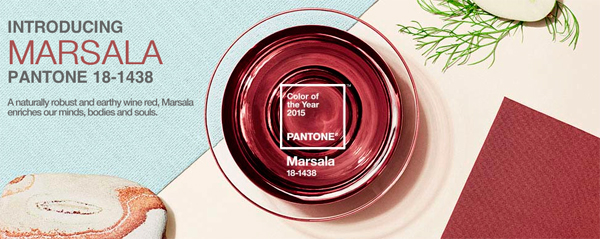
Pantone® is the world authority on colour. Each December, their U.S.-based Pantone Color Institute issues a hotly-awaited Pantone Colour of the Year, meant to influence fashion runway collections, interior decor and yes, even car manufacturers. In 2015, for example, “a naturally robust and earthy wine red” called Marsala (#18-1438, to be precise) got the annual nod as top pick for stylish nail lacquer, neckties, table napkins, wall paint and more.

   Pantone Color Of The Year Marsala 2015

Image via www.pantone.com, Marsala 2015 Color of the Year – Pantone®

Colour Strategy in Brand Success

But, your company logo and your product line is far more complex than an accessory. Clearly, when a company manufactures products, designs a brand logo, buys staff uniforms, develops new packaging designs and invests in advertising, there will be no opportunity for a 12-month cycle to accommodate trend-setting changes.

Choosing a business brand palette is not about a designer’s preference, your favourite colours or anyone else’s. Brand colour choices are long-term decisions and it’s a critical identifier and influencer on the perception and personality of your brand. Colour is also widely credited with influencing purchase decisions.

Case-in-point, most people know where this box comes from even without seeing the sterling silver jewellery it contains. Somehow, it wouldn’t quite do if the box were red.

 Tiffany's Box

Image via www.tiffany.com

The colour wheel makes your business go round and round. It speaks to your customers. It differentiates you from your competitors. It is bold and discreet at the same time. It’s interactive.

   Colour Wheel

Image via www.pantone.com

Change a signature brand colour and you’ll see how wrong it can feel:

 Starbucks Dunkin Donuts Colour Swap

Image via Fast Company Design, Paula Rupolo: Starbucks / Dunkin Donuts

It’s worth noting that Harley-Davidson is aiming to grow their 12 percent female market share with a sleek black model, not a sparkly pink one.

   Harley Davidson 2015 Street 750

Image via www.harley-davidson.com

London-based colour and design consultant Karen Haller says, “When you use the right tonal harmonious colours, your brand’s message is communicated quicker to the brain than words or shapes as they work directly on our feelings and emotions.”

It doesn’t have to be beige.

Test yourself. We’ve scrambled the colours, their interpretation and one famous example of use in branding. Can you make 10 proper pairings? (Answers are found at the bottom of this post.)

Colour Pairs Quiz

Colour Strategy at Top Brands

Apple

Apple brought colour into a marketplace where colour had not been seen before. Steve Jobs introduced colourful iMacs in tangerine, blueberry, grape, strawberry, and lime followed by indigo, flower power, and blue Dalmatian. By the summer of 2000, the first snow white iMac was a thing of beauty. [5]

Apple was the first to say about computers, “It doesn’t have to be beige” — in the course of which brand packaging helped the company recover from a two-year loss of $1.8 billion to become the world’s largest public company, top in tech and the most valuable brand on earth. [6]

  Colours I Macs 600px

Image via www.apple.com

Heinz

Ketchup is red, right? Unless it’s green. Heinz sold more than 10 million bottles of its EZ Squirt Blastin’ Green Ketchup in the first seven months following its introduction in 2000 — because kids wanted it. That’s $23 million in green ketchup sales because of a simple colour change.

 Heinz Ez Squirt Ketchup

Image via www.fastcodesign.com, Heinz

And then, they over did it somewhat by introducing purple, pink, orange, blue and a rainbow mystery colour. No quite so appetite appealing! Mums hated it, especially when kids mixed them together on the dinner plate. Some 25 million bottles later, the party was over and all but the original were withdrawn. Colour matters and ketchup is red again.

Coca-Cola

Bright red with elegant white script, the best known logo in the world is considered to be Coca-Cola, which is little changed since 1887. When, in the mid-1980s, Coca-Cola made their first product taste change in a century, they also changed the cans’ packaging design to emblazon them with Coke lettering. They wish they hadn’t. Within three months, Classic Coke was back on the shelves as Coca-Cola. Brand marketers say it was a classic mistake to mess with Coca-Cola’s iconic red and white brand packaging design.

New Coke 1985 1987

Image via Wikimedia Commons, public domain, Coca-Cola

McDonald’s

Where can you go without running into the Golden Arches? McDonald’s introduced them in 1960 to be seen towering above roadside establishments as America took to the nation’s newly-built highways. Why are the arches golden yellow? See how they stand out in this photo of McDonald’s logo seen against the blue sky. The arches rise from a field of red, very much considered the colour of choice for fast food brands including KFC, Wendy’s, Burger King, Pizza Hut, Domino’s Pizza and more. That’s it…a simple ‘M’ shape with happy yellow and energetic red, meaning “Stop here now”.

   Mc Donalds Golden Arches 600px

Image via Wikimedia Commons, public domain, McDonald’s

While colour preferences are personal, it’s universally understood that yellow means sunny and happy, while red translates as fiery and attention-grabbing. Whether a message is transmitted subliminally or overtly, the importance of colour in brand strategy cannot be overstated.

Since colour choices impact every aspect of a commercial enterprise, brand owners should aggressively re-evaluate that choice throughout their brand’s strategy, logo, brand collateral, packaging design, web design, product development, advertising and so on. Has your brand’s colour palette been selected with the right intent and applied to best possible effect? We’re here to help ensure that the answer is emphatically “yes”.

PPP-eProduct-Enroll-eCourse-800x700px

What do you think about the use of colour in branding?


  • Would you like to know more about how colour selection makes a significant difference in consumers’ intent to purchase?


  • Do you suppose that consumers (or just designers) are influenced by Pantone’s Color of the Year?


  • On brand design, have you considered whether your brand’s colour palette is a good fit with your product or service?


  • How did you score on the answers to the colour matching quiz for brands?

Answers:

Yellow = Optimistic, positive, cheerful / Veuve Cliquot e.g. Cara Matches

Blue = Trustworthy, dependable / Facebook e.g. Wavin

White = Simplicity, purity  / Apple

Green = Growth, freshness, natural / Starbucks e.g. Connemara

Pink = Youthful, energetic, playful / T-Mobile e.g. O’Egg White Eggs

Brown = Honest, simple, down-to-earth / M&Ms e.g. McConnell’s Gourmet Smoked Foods

Purple = Nostalgic, royal, sophisticated / Cadbury e.g. Massey Bros.

Black = Elegant, luxurious / Guinness e.g. La Moulière

Orange = Trendy, fun, approachable / Easy Jet

Red = Bold, powerful, exciting / Coca-Cola e.g. Tilley’s Confectionary

[1] http://www.emeraldinsight.com/doi/abs/10.1108/00251740610673332#

[2] ink.springer.com/article/10.1007%2Fs11747-010-0245-y

[3] https://blog.kissmetrics.com/color-psychology

[4] http://www.pantone.com/pci

[5] http://lowendmac.com/2005/which-imac-is-it-low-end-mac-guide-to-g3-imacs

[6] http://www.telegraph.co.uk/finance/globalbusiness/10002790/The-worlds-biggest-companies.html?frame=3293648

Brand Recall: 8 Strategies for Building a More Profitable Brand

82% of all high level corporate executives in the US stated that their customers had higher expectations of their companies than just three years before, 60% of executives found it difficult to please their customers, and 42% stated that consumers are using social media to shame their company into meeting increased customer demands, according to a Lithium survey.[1]


Obviously there is significant room for improvement in the marketplace amongst brand owners. Building a powerful brand is challenging, but consistently providing a great customer experience is central to any successful brand and consequently the quality of recognition, recall, referral, repeat purchase and overall brand affinity achieved amongst your primary target audience.


A positive brand exposure and customer experience is essential for developing brand trust and significantly improving brand recall, as a recent Macquarie University study has shown to be the case for durable goods. It is important to note that the study also revealed that advertising had significantly more influence on brand recall than merely personal experience for Fast Moving Consumer Goods (FMCG).


In order to improve brand recall in an oversaturated modern market, brand owners need to adopt highly effective and proven brand strategies. Here we share with you eight of the most important strategies, with several examples of both large brands and smaller emerging brands utilizing them to great effect.


Top 8 Brand Strategies for Enhancing Customer Recall and Affinity


1. Invest in Developing Your Brand Profile, Proposition & Purpose

The process of increasing brand recall begins with intelligent brand profile development. Your customers need to be given a reason to choose your brand over other similar options. When we work on creating a brand proposition for our clients using the Personality Profile Performer™ System, we ask them to answer a number of seemingly simple questions:

  • What purpose does your brand serve? What’s its Big Why?
  • What unique benefits do you offer that can improve your customers’ lives?
  • How would you define the idea or proposition behind your brand in a single sentence?
  • What kind of personality, messaging and tone do you envision for your brand?

The results of this initial brand profiling process sets the foundations for all future branding decisions and communications strategies. Defining what your brand stands for may not seem complicated at first glance, but these essential questions that you need to answer play an instrumental role in determining your future success, or lack thereof.


2. Create a Strong Brand Story Which Your Primary Audience Can Relate to

The most successful brands have a deep understanding of how their primary audience thinks. They know how to entice their consumers through creative storytelling, and they do so using sophisticated story creations processes like our Story Selling System™. By telling a compelling and engaging story about the company’s history, its philosophy and core brand values, you can create a positive association between your brand and the ideals that your target audience holds dear.


To truly understand the power of a good narrative, one need only look at Apple’s success in establishing themselves as a brand for forward-thinking and discerning individuals, who aren’t afraid to go against the grain and value quality and performance above all else.


Over the years, Apple has done a magnificent job of keeping the “rebel genius” narrative alive, and has proven to be a highly effective branding strategy. The reason it works so well is that it appeals to people with a specific mindset that transcends gender, race, age and generational differences. The story of Steve Jobs – a talented young man with an idea who overcomes adversity and ultimately builds a corporate empire – is compelling enough that it saw a movie adaptation starring Ashton Kutcher.


There is yet another biographical film, aptly named “Steve Jobs”, scheduled to come out later this year. While not every brand has the budget or influence to finance multiple Hollywood movies, Apple’s masterful storytelling can serve as a source of inspiration and a valuable guide for any aspiring brand.


A great brand story is your primary means of developing an emotional connection with your audience, and a fundamental way to inspire trust through its relatability. According to a 2012 Nielsen study[2] 58% of all online consumers worldwide trust the information on company websites and other owned media, and 50% trust the information they receive in emails that they have signed up for on company websites. There is always a compelling story behind a successful brand, but it must be carefully developed and told in the right way.


3. Brand Audit, Research and Look for Gaps in Your Competition’s Brand Strategy

A brand audit health check can be viewed as a diagnostics tool, a way to evaluate your brand’s awareness, customer perceptions and the effectiveness of your current brand strategy. It can point out any problem areas, potential outside threats and new market opportunities. A thorough review of your business and marketing plans, your communications and brand collateral, your internal and external audiences helps provide your company with a clear perspective on the most effective brand strategy and business structure.


To build a powerful brand, a company needs to be aware of and tracking what their main competitors and other industry leaders are doing. Another important piece of the puzzle is developing an understanding of your primary audience. Market research is key to acquiring deeper knowledge of the preferences, needs and behaviours of your target demographic together with developing buyer personas for each of your audience types. This knowledge will enable you to develop highly tailored brand strategies and exploit gaps in your competitors’ brand strategy.


For a good example of a smaller emerging brand exploiting a serious weakness of a much larger and well-established competitor, we can turn to Made Eyewear. Warby Parker had already become extremely popular, with many smaller companies attempting to copy their products, when Made Eyewear started gaining some traction in the market.


Made Eyewear 600px

Image via © www.madeeyewear.com


However, the emerging brand had something that their competition didn’t – they owned and ran their own lens company in China. This enabled Made Eyewear to produce quality products at incredibly low prices, which in turn enabled them to offer unprecedented customization options through which each individual customer could express their own sense of style. Made Eyewear had the ability to engrave the stems, as well as mix and match different colour lenses and stems, to create a truly unique pair of glasses – and offer customers the ability to try out multiple frames with prescription lenses at prices that no competitor could match.


By controlling the entire process from how the moment the product was made to the moment it reached the customer, they were able to find a competitive edge over much bigger and well-established brands.


4. Invest in Great Brand Logo Design

Creating a great brand logo is about much more than merely designing a small image that will feature on your products, website and promotional material. When our clients come to us with a brand logo design request, they are usually looking for an expert to help them develop their brand identity. We find a lot of companies struggle with defining and articulating their brand’s proposition and purpose together with answering the questions outlined in the first item of this brand strategy tips list. A good logo serves the purpose of crystalizing your brand’s message and its core values, and allows you to communicate these to your audience with maximal efficiency.


Your logo should be appropriate to the market and your primary audience, and it needs to be unique and highly memorable. It is the first thing that will come to people’s minds when they think about your brand, so it plays an important role in recognition and brand recall.


By simply placing their brand logo in the upper corner of their YouTube ad, Libresse managed to improve their brand recall by an astonishing 300%.[3] Even the viewers who only watched the ad for a few seconds before clicking away were noticeably affected.


There are numerous aspects of effective logo design that should be considered – things like the choice of colour and shapes can have a profound effect on how the brand is perceived. You can delve deeper into colour psychology here and here to found out how colour psychology influences brand strategy.


5. Humanize Your Brand and Engage Employees as Your Brand Ambassadors

Brands that make an emotional connection with their target audience achieve the greatest success. Despite the fact that many people believed that technology would eventually cause us to become isolated, social media statistics seem to show the complete opposite to be true – humans are social animals, and we have a strong desire to involve other like-minded people in our lives. Our brains are wired for face-to-face interactions, and consumers tend to trust word of mouth significantly more then other marketing strategies.[4]


Statista Social Network Facts

Image via www.statista.com


The level of trust that the general public feels for companies has dwindled over the past decade, but there is a way to reach out and earn some of that trust back – engaging your employees as brand ambassadors. As this Edelman global study has shown, consumers are highly receptive to brand promotion efforts coming from company employees.


Edleman Trust 2015 600px

Image via www.edelman.com


You can turn your employees into brand ambassadors gradually. Making social sharing an integral part of everyone’s workday is an effective way of nurturing brand advocates.[5] Apart from this, you can further humanize your brand by being highly receptive to consumer feedback, offering various perks to your loyal customers and providing exceptional customer service.


6. Eliminate Factors that Jeopardize Your Brand Reputation

When building a brand it is also important to identify all the potential reputation risks that could undermine or destroy your hard earned reputation and nullify all your marketing efforts. We won’t cover all the details or get overly technical in this paragraph, as it is quite a vast topic, but we will provide some insight into the basics.


If we set aside things such as common security threats, e.g. corporate espionage and cyber-attacks, the number one reputation risk are social media blunders. Even the largest brands in the world, with impressive online marketing budgets, keep damaging their reputation with inappropriate comments, hashtag misuse, and attempts at exploiting tragedies.[6]


A brand must have a preventive approach to reputation risk management, i.e. companies should strive to discover and eliminate potential risks, rather than try to deal with the fallout after the damage has been done. This can be done by focusing on a thorough exploration of all factors that can jeopardize your brand reputation by high level executives, regularly scanning the internet for potential risks and enforcing a strategy of proactive reputation risk management.


7. Reach Out to Your Target Audience Through Social Media and Build Connections

We have already mentioned that engaging your employees in social media sharing can help you create a powerful team of brand ambassadors that the public will trust, but social media can be utilized in an even more direct way – to connect to your target audience firsthand.


This approach has many advantages:

  • Consumers provide you with useful feedback
  • Loyal customers are given a behind-the-scenes look at your brand
  • You can organize giveaways and offer additional content
  • You can enhance your customer service
  • By encouraging social sharing, your loyal customers become your brand ambassadors


Social media can be used to help you tell your brand’s story in great depth, and you can make your consumers and products themselves a part of the narrative. The British luxury department store Harrods offers excellent customer service through open social media communication, and their efforts, such as their immensely successful “Twenty Ate Days” campaign that focused on promoting each of the 28 different restaurants within their store, have yielded impress results.[7]


There are a multitude of different social media platforms which your brand can leverage to build it’s own unique online strategies for improving brand recall – e.g. posting “How to” videos and reviews on YouTube, sparking conversations with consumers on Facebook and so forth. The skill lies in choosing the platform most suited to your product or service and your primary target audience.


8. Be Consistent in Your Brand Strategy

Even though some companies revamp their brands every few years, household names like Nike have remained true to their core brand values, mission, promise, logo and slogan for a long time. They adapt their campaigns and brand strategy to suits evolving market trends but their fundamental brand DNA remains unchanged. They stay focused on the essentials – they market their shoes to athletes and pride themselves in a high level of sports performance.


Your branding must be consistent to be successful, i.e. grow from the same core brand philosophy, values, mission, promise and focus on a consistent brand voice and messaging, together with consistent quality brand collateral design across all your touchpoints, both on and offline.


You might also like:


• Rebranding Strategy: Why Your Rebrand Must Embrace Storytelling


• Brand Profiling: Top 6 Components to Creating a Strong Brand Personality


• Brand Sponsorships: The Best Brand Ambassadors Are Already On Your Payroll


• Brand Management: Top 10 Tips for Managing Your Brand Reputation


• Brand Differentiation: 30 Ways to Differentiate Your Brand


• Brand Strategy: 6 Lessons Learned from Tourism Queensland, One of the Most Successful Branding Campaign’s Ever


• Brand Voice: Differentiating Through Your Own Brand Language and Attitude


• Humanizing Your Brand : Why It is Key to Commercial Success


• Brand Strategy: 7 Winning Components of a Market Leading Brand Plan


So, what do you think?

• Is your brand message clear, and in keeping with the preferences of your target audience?


• Does your brand have a compelling story that connects with people on an emotional level?


• Is your brand logo a worthy representation of your core brand values and your brand message?


• Are you making an effort to humanize your brand and reach out to customers on social media?


• Do you know what factors can negatively affect your brand reputation, and do you have a comprehensive brand risk management strategy in place?


[1] Lithium (San Francisco), “Corporate America Under Pressure From Consumers’ Rising Expectations (Press Release)”, June 2015

[2] Nielsen (New York), “Global Consumers’ Trust In ‘Earned’ Advertising Grows In Importance”, April 2012

[3] Think with Google, “Libresse improves brand recall by 300% with logo placement”

[4] Kimberly A. Whitler, Forbes, “Why Word Of Mouth Marketing Is The Most Important Social Media”, July 2014

[5] Sandy Gibson, SocialMediaToday, “Cognitive Dissonance: Why Social Sharing Creates Employee Advocates”, February 2013

[6] Eric Samson, Entrepreneur.com, “10 of the Dumbest Social Media Blunders Ever”, June 2015

[7] Businesscasestudies.co.uk, “Increasing Brand Awareness Through Social Media Communications (a Harrods case study)”

Limited Edition Packaging: How to Use it as Part of Your Brand Strategy

Store aisles and eCommerce pages are packed with products sold in limited-edition packages that are intended to drive increased sales. However, industry data publicized by Nielsen indicates that as much as 90 percent of new limited edition packaging designs don’t have the desired effect—and in some cases, may even hurt brand equity.

On the other hand, to a faithful collector of a favourite DVD series or dedicated brand loyalist, limited-edition packaging can be a compelling reason to purchase a new or alternative version of a much desired product as soon as possible. Indeed, it could be argued that the entire concept of limited-edition packaging is meant to urge consumers to open their wallets on the spot. Waiting too long could result in disappointment.

Below, we’ll look at several case studies, along with the associated benefits and downsides. This information could help you decide whether limited-edition packaging is a great brand strategy decision that will lead to outstanding results—or whether it’s likely to incur more costs than benefits.

Limited Edition Packaging that Promotes the Concept of Scarcity: Special Monopoly Sets Offer Real Money

Sometimes indicating that a product is a limited-edition item only available for a short period of time is enough to stimulate sales. Interested buyers can quickly recognize that there’s a relatively small number being made, and that fact makes them want it more.

Those items are frequently prized by collectors, and in other cases, people just desire them for the novelty value. Hasbro, manufacturer of the popular game Monopoly, successfully used this concept of scarcity to market the game via a specially packaged limited edition version.

To celebrate the game’s 80th anniversary, 80 versions of the game that were sold in France came with real money. In most cases, the genuine currency was mixed in with fake bills. However, one of the packages came entirely with spendable real euros. The benefit of this approach is that it appeals to people who might already want to buy the game for nostalgic reasons to reminisce about their childhoods by playing this classic game. Plus, since only 80 game sets of this sort were made, the scarcity factor drives up the perceived brand value.

For many hopeful customers, the act of opening a Monopoly box to see if it came stocked with real spendable money was probably something akin to when Charlie Bucket of Charlie and the Chocolate Factory anxiously ripped open the candy bar wrapper to see if it contained the coveted golden ticket that allowed him and a select group of others admittance into Willy Wonka’s magical candy-making site.

Limited Edition Packaging Designed to Leverage Core Brand Messages: Scotch Magic Tape

Scotch’s Magic Tape is very popular because of the way it seems to disappear onto paper after applied. The brand has even developed a dispenser so people can only use one hand to put the tape in place.

A few years ago, German company Kolle-Rebbe designed packaging that contained mirrored panels inside to create the illusion that the Magic Tape package was empty, even though it was holding five rolls of the adhesive. The special tape package even won a CLIO Award, which is the equivalent of an Academy Award in the film industry, but instead honours design, advertising, and communication professionals.

The box design promotes the brand’s “invisibility” benefit, and is an unconventional idea that makes people take notice when surveying available adhesive choices. That’s true even if they are not already familiar with what makes the tape stand out from competitors. The branding message indicates that Magic Tape makes paper tears “disappear”, because it patches them up so clearly. Plus, as already mentioned, the tape’s material is made to blend into the paper after it’s applied.

 Scotch Tape Magic 3 M

Image via www.packworld.com and ©3M

Furthermore, it was said that the decision to include green as the primary colour in the box’s design was a nod to a commitment to environmental sustainability. While that may be the case, it can also be strongly argued that the vivid green shade is already well-known to consumers.

There are many varieties of Scotch products, but the Magic Tape always has a green packaging design. Choosing to use any other colour when designing the “invisible” box could possibly have caused unnecessary confusion, and perhaps meant shoppers would have mistakenly overlooked the product when visually scanning store shelves.

This is a great example of how a limited-edition package can reinforce the brand message in a way which is both aesethetically ‘on brand’ and functional in its delivery, and we’ve had similarly favourable results when helping our clients combine aesthetics with functional benefits and practicality.

Limited Edition Packaging that Relies on Star Power: Michael Jackson Pepsi Cans and “Bad” Album 25th Anniversary Campaign

People around the world were devastated when Michael Jackson, the “King of Pop,” passed away. Pepsi had been a long-time partner of Michael Jackson, and that loyalty continued after the pop star’s death.

In 2012, the beverage brand launched its first global campaign to honour the artist, releasing limited edition Pepsi cans in over 20 countries. The packaging retained the brand’s usual blue background, but featured Jackson in a range of typically dramatic poses that were highly recognizable, consequently drawing instant attention from consumers.

  Pepsi Michael Jackson 600px

Image via www.marketingmagazine.co.uk ©Pepsi

To further stimulate demand, Pepsi also tapped top music stars of today to pay tribute to the artist in relation to the 25th anniversary of the Bad album. That piece of work was the seventh studio release from Jackson, and is repeatedly cited as a major influence on today’s artists. The performances were heavily viewed online and served to reinforce the concept that Jackson is one of the few artists who can boast timeless appeal across generations.

This campaign had value to music collectors, and also helped stimulate the desire in diehard fans to buy products relating to the deceased artist. Because Pepsi had to strike a deal with the managers of the late artist’s estate, the campaign undoubtedly required a significant amount of logistics. However, the challenges paid off, especially in terms of brand visibility.

Limited Edition Packaging That Supports a Charity: Bottle Green’s Stylish Drink Bottles to Fight Breast Cancer

Bottle Green sells unusual flavours of sparkling water and thereby caters to a niche market. In 2011, it developed a set of limited edition bottles that were available in the UK. The containers supported a charity called Fashion Targets Breast Cancer and featured images of stylish women. The bottles had strong onshelf impact, and were atypical to the category, which undoubtably drew the attention of their primary target audience.

Bottlegreen Csr

Image via www.packagingoftheworld.com ©Bottle Green

More importantly, that effort was part of the brand’s dedication to corporate social responsibility, and reflected a continual effort to support causes that fight breast cancer. Research indicates that when customers are presented with two similar brands in the same category, the one that supports a clear CSR activity, charity or ‘gives back’ in some way for the great good, will typically be the preferred purchase and have higher sales than the one that doesn’t. Similarly the Bottle Green CSR campaign likely helped to strengthen awareness of the brand’s charitable heart. When working with our own clients, we tend to strongly agree that a target audience feels more compelled to buy something if it aligns with a charitable cause.

Interestingly enough, unlike some brands that are sold in connection with fighting breast cancer, the range doesn’t feature a dominant pink hue. However, the arresting design of the women’s faces is very powerful. Presumably, it was more than enough to encourage customers to pick up the containers and read them more closely to get the story behind the aesthetics.

Limited Edition Packaging That Leverages Premiumisation

Luxury brands often use limited-edition packaging as part of their premiumisation strategy for adding perceived value. Oscar de la Renta is one strong example of a brand that has done this successfully—but in this case, so-called “brand evangelism” is just as important, or even more so, than actual sales numbers.

In 2011, Oscar de la Renta launched the first-ever sales initiative that was completely contained within Facebook. The brand offered a solid perfume variety of its scent Esprit d’Oscar, which was packaged inside a wearable ring and sold with a price tag of $65. After a consumer bought a ring, he or she was encouraged to share that news via Facebook. Therefore, in the space of a few seconds, awareness of the product could theoretically spread to thousands of people or more, plus make a person feel special about being among those select few who were able to snag a ring before it was too late.

  Oscar De La Renta Facebook

Image via http://wwd.com, © www.oscardelarenta.com

On the day of its release, one extremely eager evangelist found she was not able to access Facebook while at work, and was so concerned that she contacted the brand to inquire about the likelihood that the rings would be sold out before she could get one. Ultimately, a brand representative agreed to put one aside for her.

Oscar De La Renta Ring

Image via http://wwd.com, © www.oscardelarenta.com

Perhaps the most valuable aspect of this case study is that people were not able to access the purchase page for the limited-edition product without first liking the brand’s Facebook page. Before offering the limited-edition ring, the brand tested that strategy by offering free samples of the perfume to people who liked the Facebook page. In just one week, the number of likes grew by 40 percent. Furthermore, 5,000 people agreed to fill out feedback surveys.

The limited-edition ring created a win-win situation: customers got the chance to order something that had built-in exclusivity, and the brand’s marketers built their databases of interested consumers.

Limited Edition Packaging Compromises Product: Halo 3 Video Game

Early versions of limited-editions of the Halo 3 had faulty hubs in the packaging that did not consistently hold the discs securely in place. This meant many people opening the packaging with the intention of starting to play the game, found that the discs had become loose during shipping and consequently were scratched, resulting in the brand owner Microsoft having to offer replacements to its customers.

 Halo3 Packaging

Image via http://www.dailytech.com ©Halo3

Despite this initial issue, Halo 3 ended up being the top-selling title of its time. It sold a total of $170 million on release day, and more than 1.7 fans decided to splurge on the $70 limited-edition version.

This is a good example of how limited-edition packaging must be properly tested to ensure they are fully functional as well as aesthetically eye-catching. The brand’s reputation didn’t really suffer as a result of the packaging problem, and neither did early sales. However, it’s important to remember that many brands don’t have the built-in advantage of such a large and dedicated fan base.

Those players were so eager to become immersed in the latest Halo release that the faulty packaging might have momentarily frustrated them, but it almost certainly wasn’t enough to cause the consumers to think twice about buying another Halo game or recommending them to friends. In this case study, the other inherent benefits of the game outweigh the issues with the packaging.

Packaging That’s too Bulky, Which Makes Storage or Merchandising Difficult: The Simpsons Box Sets

Boxed TV series sets are perpetually popular gifts, and great ways for TV fanatics to indulge themselves by being able to watch favourite episodes at any time. It’s not unusual for boxed sets to have holographic portions, fold-out sections, and other embellishments that aim to add aesthetic brand value. However, in the case of boxed sets for FOX’s animated hit, The Simpsons, the quest to dazzle perhaps went a bit too far.

 Simpsons Packaging 3 D

Image via http://www.tvshowsondvd.com

The DVDs were packaged in boxes with three-dimensional facial features from popular characters. However, this limited edition packaging feature made the DVDs very hard to store because the more bulky packaging required extra shelf space when stored alongside other DVDs. Eventually, the manufacturer announced it would also be possible to buy a version where the three-dimensional parts could be removed, making the front of the box flat for easier storage.

The Simpsons brand has a very strong established fan base so it’s very unlikely that viewers would elect not to buy the DVD sets just because they had a bulky design. However, by making the decision to also offer a version where the three dimensional facial features could be removed, the manufacturers had to incur extra overheads, which potentially cut into increased profits.

We frequently caution our own clients that it’s crucial to perform a brand audit or extensive research around the feasibility of a limited-edition packaging strategy from multiple perspectives before proceeding to brand design or production. A lack of research, proper prototype testing or unchallenged assumptions can incurr unexpected costs which eat into a campaigns profitability, or worse, cause it to run at a loss, so please do your homework before your invest in your limited edition packaging!

Limited Editions Packaging Delayed Shipment of Product: Batman: Arkham Knight Game

A special YouTube channel was created to stimulate demand for the Batman: Arkham Knight serial superhero game. However early adopters didn’t get entirely what they expected when they enthusiastically purchased the game online following a teaser campaign with video clips from scenes of the game.

Gamers who pre-ordered the limited edition of the Batman: Arkham Knight game from Amazon UK received an e-mail saying there was an unspecified problem with the packaging, which meant those shoppers would get their physical goods nearly three weeks later than expected.

Because many people specifically pre-order limited-edition goods to get them on or before the official release date, this announcement undoubtedly caused some disappointment. To compensate, Amazon UK said it would provide download codes so people could play the games on the release date, even without having their physical goods.

Unlike the above instances of packaging issues, this example probably caused more logistical headaches than financial ones. The availability of download codes meant that even though buyers couldn’t immediately enjoy the tangible goods they were promised when pre-ordering the limited edition, they could at least play the game on time—which was probably a sufficient compromise for many customers.

What’s unique about this case study compared to the others we have examined is that the limited-edition packaging not only caused hassles for the manufacturer, but also for a retailer.

What We Can Learn From These Case Studies

As the above examples demonstrate, there are many advantages to using special edition packaging as part of your brand strategy. Specifically, it usually works best when:

  • The limited-edition package is produced in extremely small quantities. This helps give items exclusivity and inceases desirability as consumers make dedicated efforts to buy them.

  • The packaging leverages and enhances the product’s branding, but still has design elements that are familiar to consumers thereby strengthening brand affinity.

  • Unusual packaging design details are integrated, but not at the expense of outweighing functional use or practicality or by becoming excessively costly or difficult to ship, store or merchandise.

  • Pop culture references and/or celebrities are leveraged through brand collaboration or joint venture to increase the perceived value of a limited edition package.

  • The special edition packaging is designed in support of a charitable cause. It’s especially helpful when endeavours like these align with a company’s already-established commitment to corporate social responsibility.

  • Items featuring limited edition packages are sold solely through social media, and people can only make purchases after first interacting with the brand’s social media page in a designated way. This approach can theoretically help a brand gain traction on social media, connect with people who might not ordinarily use social media except to buy the products, and assist with building a database that’s populated with customer feedback and contact details.

However, limited-edition packaging can also be very cost- prohibitive, to the point where profitability is undermined if not properly researched and tested. That scenario is more likely if:

  • Proper testing is not carried out in advance to ensure the elements of the limited-edition packaging performs well functionally and aesthetically. That should include taking steps to see if the packaging can withstand the rigors of being shipped around the world.

  • The limited-edition packaging is too ‘ordinary’, so it doesn’t resonate strongly enough with its primary audience. In some cases, this may mean the packaging only seems valuable to people who have proven that their brand loyalty is so deep that they’ll buy a limited-edition package even if it’s not really all that special or very eye-catching.

  • Packaging details are very complex and overly elaborate. Sometimes, focusing too much on the artistry can mean practical and functional needs get overlooked or undermined.

  • It becomes evident that the production time for a limited-edition packaging will be longer than expected, meaning the products won’t be distributed on time to meet customer expectations or launch timelines.

The Final Limited Edition Packaging Brand Strategy Takeaway

If you decide to use limited edition packaging as part of your own brand strategy then its important to ensure you blend all the functional brand essentials with the brand aesthetics, while remaining true to your core brand values and positioning.

You should also ideally conduct research, not only to test your prototype but to ensure there is actually a market for your limited line that will be attracted to your special limited edition packaging, and if you aren’t sure, weigh up the costs of doing a very small batch test of special packages. These precautions can help make your limited-edition packages much more successful instead of turning into marketing decisions that eat up profits, undermine your brand and frustrate customers.

You may also like:


• Packaging Design: How to Make it into an Irresistible Customer Brand Magnet


• Brand Differentiation: 30 Ways to Differentiate Your Brand


• Rebranding Strategy: Using Premium Repositioning To Increase Profitability


• Brand Personality: Is Your Brand’s Character Big Enough to Compete?


• Creating New Brands: Top 10 Tips for Brand Success


• Brand Management: Top 10 Tips for Managing Your Brand Reputation


• Humanizing Your Brand : Why It is Key to Commercial Success


So what do you think?

  • Do you agree with the claim that the Scotch Magic Tape packaging was green to promote environmental sustainability, or was that message just being broadcast to urge eco-minded shoppers to buy the tape?


  • Is the approach of offering a limited edition product solely on Facebook, as Oscar de la Renta did, a worthwhile brand strategy, or do you think it might be missing an opportunity with interested customers who’d perhaps like to purchase the items, but don’t use Facebook?


  • Do you think it’s more effective to showcase corporate responsibility by using packaging design that’s very obviously made to support a charitable cause, or is the “less is more” tactic used by Green Bottle a clever one?


  • In cases where smaller brands want to use pop culture references for broader brand positioning, but don’t have the resources to consider global stars like Michael Jackson, what other possibilities could they explore?


  • While developing limited edition packaging, how important is it to get input from consumers about the features they would like to see? What do you think is the best way to acquire that information? Should you reward participants in return for their feedback?


Baby Boomer Branding: How and Why to Market to this Lucrative Demographic

Although there’s a lot of talk about millennials and their desire to engage in consumerism, it’s important not to overlook the baby boomer generation, born from the end of World War 2 up to the early 1960s (roughly between 1946-1964). After all, Baby Boomers hold 70 percent of all disposable income in the United States.


Also, government data indicates that the baby boomers outspend other generational groups’ spending on consumer products and services by an average of $400 million.


Branding Strategies for Baby Boomers: A Unique Process


If those statistics have stimulated your curiosity and made it clear that to overlook the baby boomer demographic is potentially a very costly mistake, keep in mind that you can’t just retool most of your brand concepts currently used to reach out to older target markets.


For starters, baby boomers are usually very loyal to brands—and as shown by the opening statistics, they have disposable income. Also, don’t assume that this demographic will settle for less as they get older, or even that they’ll settle down.


When looking at the specifics associated with marketing to baby boomers, experts have found that this group prefers living in comfortable homes surrounded by the latest amenities. Also, they generally want to maintain very active lifestyles. Those findings align with what we’ve discovered when developing brands to meet the needs of affinity groups within this demographic.


Misconceptions about Baby Boomers are Common


Even marketers who are guided by solid research and good intentions sometimes miss the mark as they attempt to resonate with the baby boomer generation. Often, that’s due in large part to some pervasive misconceptions.


Earlier, we mentioned how baby boomers tend to be faithful to the brands they love. That’s true, but it doesn’t necessarily mean that baby boomers are set in their ways. According to Nielsen research from 2012, only five percent of advertising budgets were geared toward baby boomers, but some experts believe baby boomers are not as brand loyal as millennials.


There’s another prevailing assumption about baby boomers, which some of our clients have expressed: the belief that baby boomers are not tech-savvy.


Although baby boomers were not early adopters of technology, they tend to use tech devices more frequently than you might expect. However, they do so differently than their younger counterparts.


Whereas a younger person might primarily use social media to connect with friends, baby boomers may feel more compelled to do so because that’s the way their kids and grandkids share updates and photos. The shift over to technology, in many cases, probably wasn’t primarily out of desire, but because boomers realized social media was the quickest way to keep in touch with younger generations.


Additionally, apps that are related to health services frequently get built for cross-generational appeal. Some boomers have shown interest in using an app that might help them check in faster for a hospital appointment or enjoy easier access to medical records, for example.


Finally, some marketers seem to forget that the baby boomer generation encompasses anyone between the ages of 51 and 69. It’s not sufficient to believe that certain branding strategies will universally connect with everyone. A younger baby boomer might prefer very active vacations, while one who’s nearing 70 or older may want to go on a cruise instead.


Of course, that’s a very broad example. The point is, marketers should try to focus their brand strategy on reaching baby boomers of certain ages, through developing affinity groups as a tool for profiling them or at least recognizing that older baby boomers have different needs and desires than younger ones.


Examples of When Multi-Generational Branding Strategies Can Work


Even though you’ve now learned how there’s a fine art to baby boomer branding, don’t get discouraged and think it’s necessary to do away with every tactic you use to appeal to younger generations. In fact, research has shown there are some valuable commonalities. In fact, some of our clients achieved the best results with cross-generational approaches.


Specifically, both boomers and millennials love bargains, and a high percentage of them (more than 80 percent for either group) are very comfortable shopping online. Also, 75 percent of boomers and millennials are more likely to purchase something if it’s associated with a perk, such as a loyal discount or a coupon.


Now, let’s take a look at some actionable strategies, and case studies of companies that have used them well.


Case Study: J. Jill and the Uncomplicate Clothing Line


As discussed above, baby boomers don’t want to settle for less when they get older. The clothing brand J. Jill took that into consideration with its Uncomplicate collection, which is marketed toward baby boomers.


 J Jill Site 600px

Image via www.jjill.com


The goal is to show that like younger generations of females, older women also deserve wardrobe upgrades. With this clothing line, they can look forward to clothes that are equal parts fashionable and comfortable.


Focus groups held before the new line kicked off found that women prefer attire they can easily dress up or down. When analyzing details of the Uncomplicate line, marketers realized that baby boomers wanted to look their best, without wasting time that could be used for more important pursuits. J. Jill also embraces a mix-and-match style with its Wearever line. These proactive steps reflect the brand’s realization that baby boomers have just as many reasons to enjoy new clothes as younger generations.


No matter how you market to boomers, we’ve found that customers respond best when you make it easy for them to meet their identified needs.


Case Study: Harley Davidson’s Tricycles


Baby boomers don’t like to be given the hard sell. They want to see the benefits of a product, but not in an intrusive way. Sometimes, brands have enough of a built-in following that people of all ages understand there are inherent advantages to choosing them, so there’s no need for a massive marketing campaign.


 Harley Davidson Free Wheeler 600px

Image via www.harley-davidson.com


Harley-Davidson has released a three-wheel motorcycle called the Freewheeler that’s made for great stability, but still reaches impressive speeds. The Freewheeler is an improvement on a previous model of a three-wheel model, which was called the Tri Glide. In comparison, the Freewheeler is less bulky and features a lighter weight than its predecessor. Reviews of the Freewheeler trike are generally favorable, and the brand’s press release boasts, “Riding on three wheels has never been cooler.”


Going back to what you’ve read about baby boomers wanting to stay active, this trike is a perfect example of that principle. Sometimes it’s not necessary to reinvent a product so it caters to baby boomers, but to just tweak the details while preserving the familiar aspects that attracted consumers in the first place.


Case Study: Spirit 50


Across the world, there have been concerns that as baby boomers get older and require more medical attention, there will be an increased demand on the healthcare system. One forward-thinking Canadian entrepreneur named Erin Billowits is trying to keep baby boomers healthier as they age by marketing a fitness program that lets her demographic work out at home. The program, Spirit 50, combines instructional videos with step-by-step instructions. Users can even purchase consultations that take place over Skype.


  Spirit50 600px

Image via  www.spirit50.com


In her research, Billowits found that a majority of baby boomers want to improve their health, and many are willing to make small, proactive changes without being prodded.


When designing her fitness program, Billowits looked at possible technological barriers. As you can see from the format of this YouTube clip, the exercises are explained in a straightforward way that’s not patronizing. Also, because the videos aren’t lengthy, most browsers should start playing them right away.


If you plan to market something to baby boomers that’s technological in nature, it’s important to do the legwork beforehand and make sure your concept doesn’t come across as overwhelming. Billowits identified that a need was there, but she recognized that some of her clientele may not be willing to embrace her exercise concept if it took them too far out of their comfort zones. 


Furthermore, to sign up for a fitness plan, users only have to submit usernames, passwords, and e-mails. That’s simple enough even for baby boomers who aren’t accustomed to filling out a lot of online forms.


Case Study: Japanese Convenience Stores


In Japan, convenience stores are doing whatever they can to appeal to an older demographic. Executives have realized that a growing number of people from the baby boomer generation are stopping into Japanese convenience stores to get what they need without delay. A few major brands are branching out by offering a home delivery service of nutritious and easy-to-make meals, including bento boxes. This strategy appeals to boomers who aren’t willing to sustain themselves on sodium-riddled frozen dinners of low nutritional value.


Some stores stock attire that’s marketed toward an older demographic, but others focus on more practical things, such as healthcare items that baby boomers might need. Others have thrown their hats into the ring and aimed to meet needs that are a little more obscure, but still have merit. Two examples are health advice counters, and karaoke equipment that turns convenience stores into social gathering places for baby boomers who want to have fun among their peers.


These kinds of purpose-based approaches make sense. If baby boomers feel alienated due to a perception that most of what’s available to consumers isn’t relevant to their lives, they’re less likely engage with a particular brand or shop at a particular establishment, no matter how convenient it claims to be.


Case Study: Ford Motors


As Ford Motors has discovered, successfully marketing to baby boomers starts during the engineering process. The company makes some of its auto engineers wear “aging suits” that mimic what it’s like to be an older driver. Dubbed the Third Age Suit, the device is designed to make a person physically feel approximately 30 years older. Using a corset and orthotic devices, the suit causes stiffness in the hip region, knees, shoulders, and feet. Earplugs simulate being hard of hearing, and special goggles mimic vision-related disorders that are common in older adults.


Although this case study doesn’t represent an example of direct marketing to baby boomers, it demonstrates an effort made by engineers in the early phases to understand how aging affects driver capabilities and comfort. This could eventually influence baby boomers to choose certain makes and models of vehicles over others.


A Worthy Venture


Clearly, the baby boomer generation is not to be overlooked when it comes to ensuring that your brand gets noticed by those with a great deal of purchasing power.


Although it’s necessary to tailor your branding strategies using some of the methodologies discussed above, the ultimate payoff could be a major factor in helping your business stay competitive and indeed become more profitable in a crowded marketplace. 


You make also like:


• Millennial Branding: Creating Brands to Appeal to Teens and Young Adults


• Rebranding Strategy: Why Your Rebrand Must Embrace Storytelling


• Brand Profiling: How to Use Emotion to Make Your Brand More Profitable


• Brand Audit: Tips for Determining Your Brand’s Health – Can It Be Improved?


• Brand Strategy: 6 Lessons Learned from Tourism Queensland, One of the Most Successful Branding Campaigns Ever


• Packaging Design: How to Make it into an Irresistible Customer Brand Magnet


• Brand Personality: Is Your Brand’s Character Strong Enough to Compete?  


• Creating New Brands: Top 10 Tips for Brand Success


So what do you think?


• Have you used brand profiling and positioning is when marketing to baby boomers?


• Do you think a brand name that alludes to the baby boomer market, such as ‘Spirit 50’ is an important part of the brand strategy for connecting with a target audience?


Rebranding strategy was crucial for J.Jill when realizing, during a brand audit and through market research studies, that the fashion needs of baby boomers weren’t being met. Have you had a similar moment that has made you discover that baby boomers may be an untapped market?


• In Japan, several convenience stores have incorporated the needs of an older generation into the brand identity design. Do you think that will eventually mean that the majority of convenience store shoppers will be much older than in preceding generations?


Brand positioning was a crucial aspect for marketing the Harley-Davidson trikes to a market that was already likely cued into what makes the brand worth following. Do you think that the brand strategy was comprehensive enough, or should it have been more extensive?


Feel free to share your thoughts in the comments, we’d love to hear from you.


Packaging Design: How to Make it into an Irresistible Customer Brand Magnet

The growing proliferation of multiple different brands in the market place has made customers spoilt for choice, but often at the expense of easy decision-making.


As most of us know, shopping has become a far more arduous affair where we frequently find ourselves overwhelmed and sometimes confused by the array of products on shelf and amount of decisions we’re required to make.


When presented with an assortment of options in which nothing decisively stands out, with a compellingly clear message that speaks to a customer succinctly, analysis paralysis sets in. It’s when faced with this situation that a confused shopper will typically default to making decisions based on price alone.


The question here is, where does your brand sit in the mix?


Does it stand out from the crowd with a really strong message that attracts its ideal target audience with laser edged efficiency? Or is it guilty of the ultimate sin . . . hybrid mediocrity, blending in with every other competitor and lost in the crowd!


The question for under performing brands becomes how to differentiate themselves effectively from among their competitors in a way that makes it much easier for them to attract the attention of their ideal customer and convince them to buy, all in the blink of an eye.


Mc Connells 600px 


Part of the winning formula of these high performers lies in that fact that those leading brands have absolute clarity over who their ideal customer is. Consequently they’ve developed a really strong brand message, which irresistibly appeals to their particular customer who in turn sees that brand as different, distinctive and memorable in a way that’s totally relevant to their specific preferences.


A really distinct brand has a unique brand profile, with a clear position and purpose, which helps it cut through the competing noise so it stands out, head and shoulders above the rest.


By not only being perceived to be unique but also solving problems, making life easier, supplying exclusive solutions for a particular kind of customer and communicating this uniqueness through subtle and overt on pack messaging a brand can outperform its competitors.


However don’t make the mistake of thinking that packaging design aesthetics alone are going to provide you with repeated lotto wins! Effective design must be underpinned by a well-developed strategic focus, which provides the required creative direction.  It’s when you have those insights, understanding and a fully developed brand profile that a brand can speak directly and distinctly to its ideal customer through great design.


Leading brands cut through the visual and cognitive noise created by an oversaturated market full of aggressive competitors and hook their ideal customers by meeting their needs both emotionally and rationally.


Evaluate Your Market and Define Your Brand Position and Purpose


Before any of the above objectives can be met, brands must first define their ideal customer or customers and then develop their brand strategy to reach those customers. Their branding strategy will be guided by how they respond to several key factors that help set brands apart from one another.


1. Fit for Purpose

What function does your brand serve? Does it have a deeper purpose beyond the obvious — what’s its ‘big why’? Successful brands dig deeper beyond the superficial and glaringly obviousness of their product category, to something which meets the needs of their customers in more emotionally engaging ways.

A toothbrush might seem rather hum drum and ubiquitousis. It’s certainly used for cleaning your teeth, but is your toothbrush especially effective with its new cutting edge technology making it far more thorough than the competition in removing dental plaque? Is it made with materials which have been chosen to appeal more strongly to your customers with a particular set of values? Define your unique purpose, align them to your brand values and amplify these through your messaging so your brand is separated from the rest in a meaningful way.


2. Emotionally Engaging

An emotional connection might be seen as a secondary factor, but in reality, it’s equally important and often more important than functional benefits. Is your toothbrush commanding a more premium position that not only reduces visits to the dentist, but represents the preferred choice of professional dentists and oral hygenists, making the customer feel more confident and happier with their choice? Will your extra-thorough, VIP celebrity endorsed toothbrush, the preferred choice of ‘those in the know,’ help your ideal customer feel better and more assured they have made the right decision?


3. Commercially Viable

Your brand’s positioning must be congruent with your budget and marketing strategy. Your pricing strategy, for instance, could fill a gap in between existing competitor prices or command a premium. Perhaps your toothbrush is perceived to be so much more superior compared to its nearest competitor that a higher price point is justified.


Remember that pricing can be seen as a direct value-added relationship, but higher price points or margins can also be achieved by altering brand perceptions in relation to the brand’s position to appeal to a more upscale market through premiumisation, also known as premium brand positioning. 


4. Translates Regionally, Nationally or Internationally as Required

Brands looking to scale must plan for regional or national differences combined with having absolute clarity of their buyer personas, also known as customer profiles or pen portraits of their primary target audience, if they intend to penetrate other markets. A brand positioning and profile that works well for one region may not translate so well to another, even on an island as small as Ireland or the UK. Will your ultra-premium toothbrush, which appeals to high end Londoners, be seen as irrelevant by customers in Leeds?


Combining answers to these factors and questions will help you create an overarching brand profile that matches the needs of your core customer profile. A fully developed brand profile will typically include how your brand communicates its unique:

  • Vision — The way your brand sees the world and consequently stands out
  • Values — What matters to your brand, its aesthetics or the social causes your brand cares about the most
  • Personality — The characteristics of the humanised way in which your brand speaks to your market
  • Experience — The customer’s journey from discovery of your brand to usage, referral and repeat business
  • Promise — A combination of values and experience that you pledge to uphold to your customer
  • Story — Your brand’s purpose explained through both narrative and aesthetic choices


The development of your brand profile under all these key headings are what provides the much needed direction and rational for your brand packaging design. It’s one of the most important stages in the branding process and one we engage in with every client we work with before moving on to design or communications strategy, assuming the research or brand audit work as also been completed before hand.


Every considered detail in your packaging design from the colour palette to the typography, messaging and copywriting, graphics, photography or illustration references these factors to ensure the design route chosen is relevant and effective — or what’s known in industry jargon as being ‘on brand’.


To give you a better idea of how this process informs packaging design, here are some examples of strongly-positioned brands aided by unique package designs in order to establish a compelling shelf presence and wholly original brand position. 


Three Examples of How Effective Packaging Design Can Influence Customer Brand Perceptions and Buying Decisions


Lovechock

Dutch brand Lovechock recently underwent a major rebranding overhaul, pulling off their transition beautifully. Their new package gives them a unique shelf presence, atypical to competitors in their category, through a simple shape and strikingly singular vision. The overall effect of the packaging is one that engenders trust amongst those customers looking for “free from” products of natural origin.


 Lovechock Pure 600px

 Image via www.lovechock.com/en/ 


Colour

Plain, brown kraft cardboard boxes not only speak to environmental values, they also conjure up the rich tones of the chocolate itself. A band of vibrant and natural-looking colours on the differing product labels ensures each variant is clearly distinguishable from the next while also enticing the palate with colours that excite the senses.

The simplicity of the outer pack hides a wonderful surprise inside. Open the pack to find the beauty of illustrative patterns reminiscent of decorative hardcover book end papers. This subtle design element surprises and delights, connecting to their “happiness inside” tagline whilst broadcasting the brand’s personal value set that something simple and natural can hide a deeper inner beauty.


     Lovechock

Image via www.lovechock.com/en/ 


Typography

Continuing with their “raw” theme, Lovechock uses clean and modern sans-serif fonts but with a “chunky” look that reminds you of the products natural and ostensibly handmade origins. An all-lowercase logo and “happiness inside” tagline are contrasted with the all-uppercase “100% RAW CHOCOLATE” to clearly indicate the product’s difference from the majority of its competitors.


Illustration

A simple logo in the style of the hand drawn whimsical feeling typeface continues the product’s handmade, printmaking aesthetic. The little Aztec man speaks to the chocolate’s Central American roots. He holds a “molinillo” which is a two-handed tool for whisking chocolate and blending cocoa beans into an even mixture. The end is covered in chocolate to form a heart, blending “love” and “chocolate” together. Small hearts emanating from this first heart show how positive feelings can emanate from a single, natural source.


Structural Packaging Design Details

Lovechock uses a simple shape and an unfolding box to hark back to a time when packaging was of a more handmade aesthetic. The long, blocky shape also reminds customers of the mouthwatering, log-shaped product inside, so that each bar’s box is delicious-looking by association. A tiny visible patch of the inner pattern is also used to tease the mind about the hidden pleasures and secrets the box holds inside.


Packaging Digest called this approach “seductive,” and when the ideal customer opens the pack to see the product and beautifully patterned paper lining inside their expectations will have been exceeded, assuming of course the test excels too!


The package also uses 100 percent recyclable materials to give back to the earth that produced the chocolate while also helping customers spread the love rather than their love of chocolate hurting the planet in return — all of which is totally congruent with Lovechock’s core brand values, vision, story and brand promise.


Marmite

Marmite is a brand with a rich historical legacy stretching back to the nineteenth century and yet it’s managed to maintain primary consumer relevance combined with tradition throughout the decades. Admittedly this is a very British brand with an almost a cult like following between consumers who love this spread with its distinctive, powerful, salty flavour and those who don’t — and not much in between. Marmite knows this and plays to its polarising factor to the full in its branding strategy — to great effect.


This is a brand with a strong personality, individualistic and singular in its outlook and a clever sense of humour that is very British in its quirkiness and eccentricity. It has a really distinctive brand voice that is unmistakably memorable ensuring it really stands out, indeed proudly shouts out its idiosyncratic and unrivalled specialness!


     Marmite History Jars 600px

 Image via www.marmite.co.uk


Every pack successful expresses this brand’s unique personality. Its’ bulbous shaped jar is a very distinctive shape and it has been sold in this shape since the 1920’s. Even without a visible brand name it’s entirely recognisable and consequently a very definitive unique part of the brand’s identity. An owned asset, which can’t be copied!


Part of Marmite’s incredible success can be attributed to its limited or special editions brand packaging strategy, which it started in 2002 with its 100th year anniversary. Each limited edition jar has successfully encapsulated more of the brands uniquely British personality through its messaging and choice of language, and personably use of the British vernacular.


   Marmite Limited Editions 600px

Image via www.marmite.co.uk


Since then the brand has released a significant number of limited editions packaging design lines with great success. The brand has also aligned with other iconic brands in its limited editions packaging strategy. A great example is the limited edition Marmite Guinness range produced in just 300,000 250g jars using 30% Guinness yeast in 2007 which elevated the brand in terms of profile and positioning.


 Marmite Limited Editions2

 Image via www.marmite.co.uk


The brand’s most recent limited edition packaging is themed around ‘Summer of Love’ and ‘Summer of Hate’ Marmite jars which are only available from July next month until September. Only ninety-four ‘Summer of Hate’ jars will be available across the UK (one for each day of the UK summer). Such scarcity will make them even more appealing as collectibles amongst its fans. Made with a ‘lighter summery blend’, the packaging takes its inspiration from Woodstock and the summer of love in 1967, playing on its nostalgic provenance to the full.


Marmite Summer Limited Edition 600px

  Image via www.marmite.co.uk


Boss Monster Card Game 

Sometimes, a packaging concept can be so powerful that it stands in as a major selling point of the product unto itself. American card game designer Brotherwise Games struck a chord of nostalgia with Kickstarter funders.


 Boss Monster Cards 600px

 Image via www.brotherwisegames.com


Accuracy of design was absolutely crucial to this concept in order to win over the right type of fans. The box containing the card decks looks uncannily identical to a product box for original Nintendo Entertainment System games of the late ‘80s, all the way down to the shape of the illustration border and the placement of badges.


Card game enthusiasts were so enthusiastic about the nostalgic element of this packaging design that they funded the game’s initial Kickstarter campaign well beyond all the initial funding goals.


  Bossmonster Box Sleeve 600px

 Image via www.brotherwisegames.com 


Many buyers were adamant about getting the special packaging sleeve that slid over the original package and mimicked Nintendo’s famous first “Legend of Zelda” game box. Products like these create strong emotional connections, develop cult followings and invite “unboxing” videos galore on social media.


Conclusion: Plot Your Unique Brand Path Then Journey Down It Fearlessly

In an ideal world all agencies, organisations and companies would invest resources into developing their brand strategy to ensure that it is fit for purpose, emotionally engaging and commercially successful in the short and medium term while also ensuring that it translates nationally and internationally as required across all its relevant markets.


With so many choices and options available be it at the local supermarket or online, brands cannot afford to be unclear or equivocal about their brand’s positioning, promise, personality or the way in which it communicate its values. Instead, the brand packaging must be like a lightning rod drawing energy and enthusiasm towards the shelved product.


Our experience working with many clients over the years has repeatedly brought to the fore that one of the many challenges organisations and businesses face is evaluating and developing the most effective positioning and profile for their brand — the best way in which to engage their primary target audiences and give them a compelling reason to engage and become loyal brand advocates. It’s the uppermost issue that challenenges brand owners and managers all the time, and the reason why we developed the Personality Profile Performer™, a systemized process to provide them with a much needed solution. 


People buy with emotion, regardless of gender, and justify with rationale. Consequently, every brand needs to be grounded in emotional appeal by tapping into the emotionally motivating factors that most readily engages their primary audiences. After all, there are very few, if any, truly new-to-the-world ideas anymore. To be perceived as truly distinctive, a brand must convey more compelling, sustaining differentiation, and the best way to do so is through emotion, as evidenced masterfully by Apple. Tying service, product details or even ideas to emotional values and seeking emotional connections with your primary audience cultivates more meaningful, sustained customer relationships.


In order to forge this type of relationship, your organisation needs to create an emotionally compelling, humanised brand through a highly-developed brand strategy. Part of this task includes shaping your brand, defining it and articulating what it is “all about” as well as what it stands for in the global scheme. Developing your brand’s profile involves defining: vision, values, personality, experience, promise and story, coupled with hierarchy planning — all focussed around the needs of your primary target audience. This process is accomplished using a system like the Personality Profile Performer™, which we use when working with our clients.


Applying a strategic approach in this way provides stronger direction and the essential brand foundations required for positioning, differentiation and directing the creative expression of the brand or design outputs — e.g. brand logo design, brand collateral design, web design, packaging design, etc. All of these elements can only come after the brand foundation work has been completed. The outputs from Personality Profile Performer™ help identify, and amplify differentiating brand messaging which is also used to shape the bespoke nature of integrated marketing communications as well as PR focused around the needs and preferences the primary target audience.


In the end, your brand must be able to speak to the world through its packaging in a clear, distinct voice that not only resonates with a clearly identified group but impels them to take action. Successful brands are able to reinforce emotional customer behaviours to the point where repeat business almost becomes a ritual in loyalty. Unsuccessful brands are faceless generic packs gathering dust on a shelf before they disappear forever.


You may also like:


Colour in Brand Strategy: Colour Psychology and How it Influences Branding


Rebranding: How to Make it Through a Rebrand and Emerge Stronger


• Brand Personality: Is Your Brand’s Character Big Enough to Compete?


Packaging Design: How it Can Make or Break Your Brand


Humanizing Your Brand: Why it’s Key to Commercial Success 


So what do you think?

• What promises does your brand strategy make to your primary customers?


• Does your product packaging design accurately distil your brand’s promises and the values they hold dear?


• Are the colours, graphics, typefaces, illustration or photography style used in your packaging design conveying the right brand messages?


• Are you doing everything you can to reduce your packaging’s carbon footprint or impact on the environment?


• Are there elements of your current packaging design that no longer serve your brand appropriately, or no longer fit with current trends within branding or packaging and would be best eliminated as part of your rebranding strategy?


Feel free to share your thoughts in the comments. We’d love to hear from you! 

Packaging Design: Top 16 Tips for Great Eye-Catching Packaging Design


Today’s retail environment is highly competitive place.

         • 70% of purchase decisions are made in store

         • 10% of shoppers switch brand inside a store


The most effective and profitable brands are those that stand out distinctively—and packaging design is a critical element for effective brand standout. Whether you’re developing a new brand for launch to market or rebranding an existing brand, the right packaging design can give your brand crucial visibility, helping your products stand out on retail shelves in markets where there is more competition than ever before, and attract more customers who will buy and remain loyal to your brand. Make no mistake, great packaging design is a critical part of any successful brand strategy if you want to grow your business and increase your profitability.


Top 16 Brand Packaging Design Tips


Effective and eye-catching pack design is more than simply being different, because poor packaging design can torpedo your branding efforts and sink your profits. These sixteen tips will help keep you on trend and help you develop strong brand packaging design that catches the attention of your customers, so your products can fly off the shelves.


1. Packaging Design is an Investment

Many brands fail to ascribe enough significance to packaging design, and this is a mistake that will ultimately cost you in multiple ways. An investment in high quality package design signifies to customers that your brand has value. When you increase the perceived value of your brand through distinctive, creative, carefully evaluated and well-executed packaging design, you’re able to compete with other products in your range and charge a premium price.


2. Packaging Packed with Personality

Zig when others zag! If you do things differently and develop a really compelling personality for your brand, using a system like our Personality Profile Performer™, and then bring it to life visually through all your brand collateral, in this case your brand packaging, it can have massive shelf impact.


Assuming you’ve thoroughly developed your brand’s personality and what it stands for etc. you should pick out key characteristics of your brand’s character, tone of voice, story, humour, language and leverage them to maximum effect in your packaging design in a way that’s relevant to your primary customer. It’s these kinds of details that capture attention, create distinction, engender engagement, provoke emotional engagement and help build a long term loyal and profitable customer base.


3. Study the Competition

While it’s definitely important for your packaging to stand apart, you also need to consider the known “lingo” of product category packaging—the aspects that signify what the product is, in a way your customers are already familiar with. Look to successful brands in your space and consider what their package design has in common. This does not necessarily refer just to packaging colours, but also the physical or structural design, materials used, on pack messaging and so forth. Your packaging must be distinctively different but your customers must still be able to relate to it in a way that’s relevant to them and their needs within that product category.


4. Opt for Clarity and Simplicity

The most successful brand packaging is iconic and easily recognizable—and when it comes to package design, usually less is more. Your product packaging should convey your brand at a glance, and instantly tell the customer what your product is for. Developing a clear and simple package design will go a long way toward giving your brand increased visibility on store shelves.


5. Keep it Honest

Packaging design should make your product look attractive, but not at the expense of honesty. A misleading package design that promises something not contained in the package will damage your reputation and your brand—for example, depicting a chocolate-drenched dessert on a tin of simple chocolate-flavoured biscuits is not an accurate representation of the product inside!


6. Be Authentic

Authenticity can be a difficult characteristic to define, but your customers know it when they see it. Strive to develop packaging that is authentic to your brand’s values, promise, story, alignments, platforms, and positioning statements etc. A sense of character and originality infused with your pack design can help you build a memorable brand that engages customers while also enhance brand perceptions in terms of being seen as a brand that is real and authentic – true to its purpose.


7. Differentiate Visually

A twist on the standard design styles for your product categories can help your brand enjoy increased visibility, allowing you to stand out from a sea of similar products. For instance, if most of your competitors use a horizontal layout, design along the vertical in your packaging. If the majority of similar items feature product photography, consider type-based designs, icons, or illustrations.


The choice of signature brand colours is another great way to differentiate. One striking example is Rachel’s Organic products, which use primarily black packaging for products such as butter and yogurt to jump out on retail shelves or O’Egg which uses pink on its white egg packaging.


O Egg Pink Ribbon


8. Pay Attention to Typography

The words used on your package design matter—not just what they are, but how they look and what they say. Stunning typography is an eye-catching differentiator for your packaging. Choose distinctive, premium fonts with high readability, and pay attention to spacing (kerning), the size of the text, and the colour in comparison to the rest of the package design.


The naming conventions used, together with language style chosen and messaging conveyed in the creative copywriting on your packaging design can add immensely to enhancing your brand’s personality and connecting emotionally with your primary audience. Remember, people buy with emotion and justify with rationale—male or female.


 Hema Tea 600px

Image via www.hema.nl


Dutch private label brand HEMA is a striking example of the effect of great typography. The company’s line of ready-to-eat lunch items features a handwritten-style design of labels with a very distinctive font, and simple colour bands that help to quickly categorize items in a visual nature.


Hema Juice Range 600px 

 Image via www.hema.nl


9. Embrace Green

With more customers increasingly conscious of environmental issues, investing in eco-friendly, sustainable packaging design is a smart move for any brand, not too mention helping improve your brand’s carbon footprint. Whether the packaging is limited to reduce the amount of waste, or made from recycled, biodegradable, or reusable materials, going green with your packaging can make your products more attractive and premium to customers. Sustainability is an increasingly important issue to customers and ‘responsible’ or ‘caring’ brands are seen to be more desirable.


10. Design for Durability

Depending on the supply chain process and the shelf life of your products, your packaging may require extended durability. Long-lasting packaging is especially important for slower moving, high value, consumer goods, but FMCG products will also require a high degree of durability. Damaged packaging at the point of sale or post-sale can have a very negative effect on your brand, as customers will view it as “cheap” or substandard quality.


11. Production and Manufacturing Constraints

It’s important to consider production line requirements, how your product will fill the packaging – is it hand packed or on an automated production line? What are the specific packing needs of both those environments?


When designing a pack, it’s also really important to take into account the final appearance of the product inside the package, to ensure an attractive overall presentation. Make sure the packaging is not too loose or too tight, and that it displays the product in an appealing way and that the colours or textures and so forth of the actual product are enhanced through the design of your packaging.


If something tastes incredible but visually doesn’t look too appealing then maybe you should not make it visible within your packaging design. On the other hand if yours is the kind of product that visually sells very well, particularly when enhanced with great packaging—like a lot of bakery goods or confectionery—or consumers really need to see it to make their purchasing decision such as with certain perishables like meat, fish or vegetables then you need to take this into account within your packaging design.


12. Choose an Unusual Shape

Package design with an unusual shape can be a very challenging process, but very worthwhile for the right idea. A uniquely shaped package truly stands out on retail shelves and can become a trademark protectable and uniquely valuable asset of your brand. Other important design choices here include display considerations, such as allowing the package to stand or stack on shelves appropriately too.


  Gloji Bottle 600px

Image via www.gloji.com


Gloji uses a unique package design to fantastic effect with its light bulb-shaped juice bottles, which are meant to represent the healthy properties of the beverage that “light you up” from the inside.


13. Think Beyond the Shelf

Your package design should continue to work effectively even after purchase. Making a package that’s too difficult to open will turn off customers, making them less likely to stay loyal to your brand. Another consideration is product use. If all of the product won’t be used immediately, you’ll need a way for customers to reclose the package and store unused contents or portions. It also needs to ‘look attractive’ in the home or out of the retail environment so it continues to sell itself and reaffirm important, asset building brand values.


14. Choose Special Materials

Giving your package design a luxurious detail or two can help your brand stand out. Consider invoking the customer’s sense of touch through materials like velvet, wood veneer, or higher quality paper. Embossing, wax seals, hot foil stamping, and letterpress seals can also add a premium touch to your pack design.


15. Add The Personal Touch

Handmade, hand-crafted, or otherwise personal details can deliver a stand-out appearance to your brand packaging. Details that appear handwritten, handcrafted, hand-tied, or individually applied can add to a really premium sense of personalization for your products. You can even create an overall handmade look for your products with creative use of production techniques—UK based organic food company Kallo uses illustrations and traditional lino printing to give their product packaging handmade appeal.


   Kallo Range 600px

Image via www.kallo.com


16. Focus on Shelf Impact

Shelf impact is a retail term that describes the way a product actually looks on store shelves—whether it blends in, or stands out. Even the most unique and distinctive package designs may not be effective if they don’t have shelf impact. This is a really important aspect of your packaging design to test before launching a product or package redesign.


Physically arrange your products on shelves, next to competitors’ items in the same product category—just as they would appear in stores. The more distinctive your product appears from the surrounding items, the better it will sell. Achieving shelf impact can take some experimentation, but it’s critically important and worth all the effort.


In fact you may be surprised to find that often overly elaborate designs tend to vanish or blend in on shelves, while simpler designs “pop” and stand out in amongst the visual barrage.


You may also like:


• Colour in Brand Strategy: Colour Psychology and How it Influences Branding


• Packaging Design: How It Can Make or Break Your Brand


 So, what do you think?


• Is your current brand packaging design category appropriate yet distinctive, different and memorable?


• What are the distinctive elements of your packaging designs and are they on trend?


• Is your use of colour similar to, or distinctive from, your direct competitors? Have you developed your own signature brand colour palette?


• How could you use non-traditional shapes or materials in your packaging?


• Does your packaging design integrate appropriate environmental factors? Is it eco friendly?


Feel free to share your thoughts in the comments. We’d love to hear from you!

Colour in Brand Strategy: Colour Psychology and How it Influences Branding

Yellow arches. A red can of cola. A bird shell egg blue jewellery box. The colours alone are enough to make you picture the brand – McDonalds, Coca Cola and Tiffany’s.


Colour and the psychology or science behind it is an expansive subject with a depth which extends well beyond the aesthetics of just ‘good design’ and subjective preferences. The context of its usage together with personal and cultural associations has significant impact in terms of meaning and perceptions, both consciously and subconsciously, together with usability and purchasing preferences. Consequently the psychology of colour and how we consider its use has a huge impact on all the work we do with our clients and their brands both in terms of brand profiling and brand design. The following four key tips will give you some insights into how colour works, what to use and what to avoid in relation to your brand.


PPP-eProduct-Enroll-800x700px


There are many studies on the use of colour all of which agree, colour greatly influences human emotion and behaviour. Colours have a powerful and unquestionable effect on branding. The right colours can distinguish your brand, attract customers and create strong brand-based loyalty, while the wrong colours can sink you in the marketplace.


In order to establish a comprehensive and effective brand identity, you must choose your colours wisely – considering not only what colours might attract the right attention within your category – while also giving your brand distinction, and for example standout on retail shelves, but how your brand colour schemes will affect customer perceptions, evoke certain moods and grab attention. Colour psychology is particularly critical in the retail environment and can make or break customer purchasing decisions.


Why Colours Matter

For your customers, colour is a powerful motivator in recognition and purchasing decisions. According to recent statistics posted by analytics company KISSmetrics:

  • 85% of shoppers cite colour as their primary reason for buying a particular product

  • 93% of shoppers consider visual appearance over all other factors while shopping

  • Colour increases brand recognition by 80%


 Kissmetrics Colour Purchases 600px

 Image via www.kissmetrics.com


The psychological reasons for the strong effects of colour are numerous. Visual perception is the primary sense people rely on – reacting to colours is hardwired into our brains. Identifying a colour triggers a diverse series of reactions that effect moods and emotions on a subconscious level…in short, colour makes people feel something and impacts their behaviour.


lorraine-carter-persona-brand-building-mastermind-700x344px


Colour is hands-down the strongest and most convincing factor of visual appeal. When you choose the right colours and ensure that your brand colour scheme is carried out consistently and coherently across your brand identity, logo, packaging design and all your brand collateral, you are creating powerful brand recognition and fostering customer loyalty that will pay off with increased profits.


The Meanings of Colours

Different colours evoke certain moods and emotions, and convey a particular sense of expectation. The meanings of colours often vary depending on a number of factors, including culture, gender, age, context and individual experiences, but the basic perceptions of colour remain fairly consistent.


Red is Passionate and Powerful:

A bold colour that stands out, red can be used to signify power or passion, and make a strong statement. Red evokes a visceral response, causing faster breathing and an increased heart rate. The colour red can be energetic, aggressive, provocative, or even dangerous – but it is always attention-grabbing.


Blue is Cool and Confident:

42% of people claim blue as their favourite colour, and that enthusiasm is reflected in the many companies that use blue in their branding. Blue colours are seen as calming, cool, serene, and stable – which is the reason for its heavy use in brands where security is a top concern, like banking and social media.


Green is Natural, Youthful and Plentiful:

A color associated with both money and the environment, green can point to health, serenity, and freshness. The meaning of green often depends on the shade used – while lighter greens are calming, deeper greens are associated with wealth or prestige.


Yellow is Cheerful and Optimistic:

Universally associated with the sun, yellow is the most visible and noticeable colour, seen by the eye before any other. Bright or warm yellows evoke feelings of happiness, optimism, and friendliness.


Purple is Luxurious and Creative:

The colour of artists and royalty, purple can evoke feelings of quality and decadence, mystery, or sophistication. The choice of shade and hue when using purple is of vital importance – light purple can be calming and whimsical, and deep purple can be luxurious, certain shades are viewed as garish or tacky.


  Color Emotion Guide


Orange is Fun and Lively:

Ranging from warm and intimate to playful and exuberant, orange can represent comfort, excitement, or even upscale quality, depending on the shade used. Light orange and peach tones are used in high-end branding, bright orange can be effective for entertainment brands, and muted orange is a favourite for restaurants because of its association with food and warmth. However, in some cases orange can come across as frivolous or cheap.


Pink is Creative and Feminine:

The range of pinks has long been associated with femininity, as well as nurturing and love. Light pinks are sweet, cute, and fun, while richer pinks can be sensual and energetic.


Brown is Straightforward and Dependable:

The right shades of brown can evoke feelings of stability, simplicity, and a dependable nature. Light browns and rich browns can be used to convey an upscale feeling. In some cases, brown can portray a rugged appeal or a feeling of warmth.


Black is Dramatic and Sophisticated:

Popular among luxury products, black is the colour of sophistication. Black-heavy colour themes can create a bold or classic look, and lend a serious air to branding schemes that conveys power and elegance.


White is Clean and Pure:

People see white as a brilliant and eye-catching colour. While not typically a main choice for branding purposes, white can be used effectively as an accent colour, or as a primary differentiator for products – such as Apple’s predominantly white range of accessories.


Factors That Affect Colour Perceptions

Not all colours are perceived the same way by the same people. Two of the biggest factors that affect the perceptions of colour are culture and gender.


Cultural differences can pose a challenge for brands looking to strengthen their international visibility and appeal. While some of the largest cultural divides of colour perception have been softened, or even erased, through widespread adoption of the Internet, these differences can still play a role in global brand identity. For example, green is considered nurturing and prosperous in the United States, evokes national pride in Ireland, and is often viewed as undesirable for packaging in France. On the other hand, blue is viewed worldwide as a positive and acceptable colour.


Gender perceptions of colours are not limited to “blue for boys and pink for girls.” In fact, blue is a favourite among males and females. A well-known study by Joe Hallock, Colour Assignments, found that among favourite colours by gender:

  • 57% of men and 35% of women chose blue (the largest segment for both groups)


  • Purple was the second favourite for women at 23%, and no men chose purple as their favourite colour—with 22% of men citing purple as their least favourite

  • Brown was the majority least favourite colour for men with 27%, while women cited orange most often with 33% least favourite

  • 14% of both men and women chose green as their favourite color


Another primary and notable difference for gender colour preferences is that men are more receptive to bold colours, while women respond better to softer colours.


Choosing Colours According to Your Target Audience

The meanings of colours are important, but more important is to be sure that your brand colours are perceived as appropriate for the brand message you’re trying to convey. This is a vital consideration, especially for brands looking to veer from the usual colour choices of their industries in order to stand out. While Rachel’s Organic Butter succeeds in evoking distinction and elegance with black packaging that stands out from all the yellow and green competition, Harley-Davidson might not be so successful if marketing a line of pink, glittery motorcycles to their male customers.


Rachel's Organic Butter Salte 600px

 Image via www.rachelsorganic.co.uk


Gender can be a primary factor in choosing brand colours. If your target audience is predominantly male, for example, you might want to avoid using the colour purple. Green or blue are good choices for nearly any audience, and softer colours can convey femininity for branding aimed at women.


Your positioning and pricing strategy can also come into play when choosing your brand colours. Black, navy blue, royal purple, and deep or dark green are common choices that signify sophistication and luxury. Oranges and yellows can convey bargains or fast-moving deals.


Ultimately, colour choice is crucial for a successful branding strategy – so consider the psychological effects of colour carefully when launching your new brand to market or rebranding your company, or an existing product or service.


What do you think?

• What kind of emotions do your current brand colours evoke?


• Are you using the right colours to convey the brand perceptions you want?


• Is your brand colour palette similar to the colours your competitors use? Is the distinction helping or hurting your brand?


• What colours would you consider using to rebrand your products, packaging, and identity to maximise your success?


• Who is your target audience, and what colours would grab their attention?


Feel free to share your thoughts in the comments. We’d love to hear from you!


PPP-eProduct-Enroll-eCourse-Here-800x700px