Client Brief:
The Chivers Conserve packaging revamp required it’s rejuvenation and reassertion as the premium brand offering; delicious, high quality, high fruit content with a personality that was warm, approachable, engaging and conveyed expertise in the conserve making process.
The new conserve pack needed to have a premium contemporary edge mixed with the traditional and be clearly differentiated from the Chivers lower fruit content jam range.
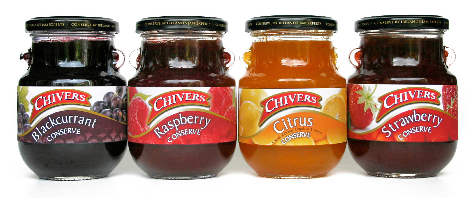
The “packed with fruit” or high fruit content appeal needed to be particularly emphasized with on pack fruit photography becoming a key element in the communication of same.
Solution:
Well photographed, beautifully fresh, high quality fruit invariable makes a very appealing visual and in the new Chivers Conserve look it was an integral element in the pack redesign.
We deliberately used both a combination of freshly picked, individual selected fruits coupled with a second supportive conserve like photograph suggesting the “conserve making” process separated by a curve reminiscent of spreading a generous dollop of conserve onto something delicious ready to eat.
The separating curve also echoed the shape of the Chivers logo which now had a much more dominant on pack presence. The finished result made for a much stronger, engaging offering which clearly communicated it’s superlative quality endorsed by the unmistakable Irish bastion of conserves.
All subsequent support collateral developed for the Chivers Conserve range has also reflected the brand continuity in both look and feel.
If you’d like to know more about how we can help you create, build, grow or re-launch your brand we’d be delighted to talk with you.
T: +353 1 8322724


 “I have worked with Persona Branding & Design for more than 8 years. They have become an invaluable extension of our team, working with us in a flexible, intelligent and pragmatic way.
 “Persona Design successfully applied their extensive branding experience from consumer goods directly to an important industrial B2B product range within our organisation. This was pivotal in the formulation of our brand communications strategy which also included design, packaging, point of sale material and brand promotional plan, all of which contributed to a very successful commercial outcome.”
 “I can’t say enough about the excellent work that Persona Branding & Design has done for us. They didn’t just look at our design requirements but challenged us to really look at the fundamentals of our brand and our target market.
 “Persona Design has always exceeded the objectives of our briefs. Their level of interaction and creative rigour offering a range of fresh concepts is brilliant.
 “Persona Branding & Design has adroitly managed several of our most important brand design briefs over the past couple of years and in doing so brought a high degree of creativity plus in depth knowledge in dealing with packaging and print suppliers that was vital for the completion of the successful end product.
